From 19 – 22 October 2017, eclectic work by talented, unknown and untrained artists descended on Paris from all over the globe for the latest instalment of the Paris Outsider Art Fair. I was lucky enough to be able to hop on the Eurostar and head over to Paris for a couple of days to check out this year’s offering. In between squeezing as much of Paris into one day as might be physically possible (breakfast in Montmartre, the Montmartre Museum, the Tuileries, the Louvre – just the building, Notre Dame Cathedral), I managed to enjoy the opening night, or vernissage, as well as a quick second (much quieter) visit on the Friday evening.
This year, as in others, the variety of work on display at the Fair was truly astounding; work by figural outsider artists (Henry Darger, Willem van Genk), to artists who are completely unknown – but equally as talented. There were familiar faces from fairs past – the Cavin-Morris Gallery, Creative Growth Art Center, and the Andrew Edlin Gallery, as well as some fresh faces. I thought the best way to share my experience of this year’s Fair with you is through the photographs I took.
In this post, writer Nick Moss considers the benefits of having a ‘code of practice’ for galleries and museums when working with outsider artists – much like there is a code of practice for those working with Aboriginal artists.
“It is perhaps to do a disservice to both art forms to make too much of comparisons between Aboriginal art and art produced by self-trained artists and artists in institutions. However, it is true of both that ab initio they were not produced for the commercial art market, and were produced by artists who had no experience of the snares and ruses of that market or the peculiarity and irrationality of its attributions of value.
Aboriginal art is rooted in the telling of the ‘Dreamtime’ stories – the symbolic telling of the creation of the world. The ‘Dreamtime’ stories are reckoned to be over 50,000 years old, and have been handed down through generations over time. They are expressed in the complex symbolic language of the Aboriginal peoples and captured in a traditional iconography which combines with stories, dance and song to pass on ‘Dreamings’ and so preserve the rites and maintain the development of Aboriginal culture in the face of settler opposition and state violence. However beautiful the works may be, their visual language is intended to serve a communicative and history-embodying rather than primarily aesthetic purpose. The works that now are produced on canvas, were, until the development of a commercial market for them, more usually produced by painting on leaves, wood carving, rock carving, sculpting, ceremonial clothing and sand painting.
In this sense then, the comparison with ‘outsider art’ can be made – outsider art often expresses private mythologies which are communicated through complex, self-produced symbolic languages, and can be set down in a variety of media, often determined by the extent to which the artist has access to particular materials at hand.
Aboriginal art serves a primarily communal function. Its attraction for, and appearance within, the commercial art market is a secondary feature of the fact of its production. This is both its strength and its weakness. Again, the comparison to outsider art can be made.
As the artist Wenten Rubuntia put it in The Weekend Australian Magazine, April 2002
‘Doesn’t matter what sort of painting we do in this country, it still belongs to the people, all the people. This is worship, work, culture. It’s all Dreaming.’
As commercial art dealers and galleries made inroads into Aboriginal communities in the 1970s, they began to take advantage of the artists who had no experience of the commercial art world, its contractual or valuation norms, and in any event were not making art for the business of art – some artists recognised the need for self organisation.
As an example, artists at Papunya and Alice Springs observed first hand the development of the private art market and the exploitation of their friends and thus formed the Warlukurlangu arts centre. The name ‘Warlukurlangu’ derives from an important Jukurrpa (Dreaming) and means ‘belonging to fire.’ The name was chosen by a number of older men and women who saw the need for an art centre and endeavoured to form an organisation that represented their interests as artists but also recognised and determined to defend the importance of the cultural laws which are embodied in the stories depicted in paint. The establishment of Warlukurlangu was one way of ensuring the artists had some control over the purchase and distribution of their paintings.
As the market for Aboriginal art increased both with regard to the volume of works coming to market and the venality of that market, the Australian Senate initiated an inquiry into issues in the sector. It heard from the Northern Territory Art Minister, Marion Scrymgour, that Aboriginal artists were often tricked by backpackers into selling their art on the cheap, and that backpackers were often the creators of purportedly Aboriginal art being sold in tourist shops around Australia:
‘The material they call Aboriginal art is almost exclusively the work of fakers, forgers and fraudsters. Their work hides behind false descriptions and dubious designs. The overwhelming majority of the ones you see in shops throughout the country, not to mention Darling, are fakes, pure and simple. There is some anecdotal evidence here in Darwin at least, they have been painted by backpackers working on industrial scale wood production.’
The inquiry’s final report (Standing Committee on Environment, Communications, Information Technology and the Arts: Indigenous Art – Securing the Future of Australia’s Indigenous Visual Arts and Craft Sector) made recommendations for changed funding and governance of the sector, including a code of practice. The report itself is a classic fudge, a refusal to fully address the ethical and legal issues arising from the commercialisation of Aboriginal art. Thus:
‘There is no doubt that there have been unethical, and at times illegal, practices engaged in within the field of Indigenous arts and craft. There are probably still instances of these problems, and there may be people seeking to take advantage of issues within the sector by ripping off artists or art centres.’
Nevertheless:
‘In spite of all this, the committee urges everyone in the sector to recognise each other’s sense of commitment, and reap the benefits of co-operation, rather than sow seeds of rancour and division.’
The Committee refused to take a stance explicitly in support of the formal regulation of the art market in relation to its exploitation of Aboriginal art. In effect, it concluded that even bad business was good business, in that it allowed Aboriginal artists to benefit from the untrammelled joys of free market capitalism.
‘Much of what was claimed about business practices appeared to be based on hearsay, and there was little tolerance of the diversity of people and legitimate ways of doing business which might all contribute to the benefit of Indigenous creativity, Indigenous art and Indigenous prosperity.’
The ultimate outcome – self-regulation via a Code of Practice was far from ideal, but the Code of Practice itself makes for useful reading. In particular, the section on Dealing with Artists, which is produced below in full:
Dealer Members must use their best endeavours to ensure that every dealing with an Artist in relation to Artwork involves the informed consent of the Artist. The following clauses will assist Dealer Members to ensure they have the informed consent of Artists.
3.1 Provide a Clear Explanation of the Agreement: Before making an Agreement with an Artist in relation to Artwork, a Dealer Member must clearly explain to the Artist the key terms of the proposed Agreement, so that the Artist understands the Agreement (for example, using a translator if required). The explanation should be given by the Dealer Member to the Artist either directly, or through an Artist’s Representative, in the manner requested by the Artist or Artist’s Representative. If there is any doubt about whether the Artist fully understands the explanation, the Dealer Member must also give the Artist the opportunity to ask a third party for assistance to help the Artist to understand, and negotiate changes to, the proposed Agreement.
3.2 Agreements with Artists: An Agreement between a Dealer Member and an Artist in relation to Artwork (whether written or verbal) must cover the following key terms: (a) a description of the relevant Artwork(s), including the quantity and nature of the Artwork(s); (b) any limitation on the Artist’s freedom to deal with other Dealers or representatives; (c) whether the Dealer Member is acting as an Agent or in some other capacity; (d) the cooling-off rights (which must be in accordance with clause 3.3) and how the Agreement can otherwise be changed or terminated; (e) costs and payment terms for the Artwork (which must be in accordance with clause 3.4); (f) details about any exhibition in which the Artwork is to appear, and any associated promotional activities; and (g) any other information determined by the Directors and notified to signatories to the Code from time to time.
3.3 Artist’s Cooling-off Rights (a) An Artist or Artist’s Representative may terminate an Agreement within: (i) 7 days after entering into the Agreement; or (ii) such longer period as is agreed between the parties. (b) A Dealer must not require the Artist to pay any fees, charges, penalties, compensation or other costs as a result of the Artist exercising cooling-off rights under this clause 3.3.
3.4 Payment for Artists: An Agreement must also cover the following in relation to each Artwork: (a) the amount of the payment and the means by which the payment will be made; (b) the date by which payment to the Artist will be made which (unless otherwise agreed) must be: (i) where the Dealer Member is acting as an Agent, no later than 30 days after receiving funds for the Artwork; and (ii) where the Dealer Member buys Artwork directly from the Artist, no later than 30 days after the Dealer Member takes possession of the Artwork; (c) if the Dealer Member is acting as an Agent, the amount of the Dealer Member’s commission; (d) any factors known to the Dealer Member that could affect the payment terms; and (e) the cost of any goods and services (e.g. canvas, paint, paintbrushes, framing, etc) to be deducted from the payment to the Artist (if any).
4.1 Record Keeping by Dealer Members (a) A Dealer Member must keep records of all dealings with Artists, providing clear evidence of the key terms, and performance of those key terms, of any Agreement between the Dealer Member and Artist (the Records). (b) If the Dealer Member is an Agent, the Dealer Member’s Records should also include: (i) details of Artwork held by the Dealer Member for sale; (ii) the dates of sale of Artwork by the Dealer Member; and (iii) the type and quantity of Artwork sold by the Dealer Member and: (A) the price received by the Dealer Member for the Artwork sold; and (B) details of the payment to the Artist (including the amount, date and method of payment) and details of each amount deducted by the Dealer Member from the sale price of the Artwork (for example, the Dealer Member’s commission on the sale). (c) If the Dealer Member purchases Artwork and subsequently on-sells the Artwork, the Dealer Member’s Records should also record the price the Dealer Member was paid for the sale of that Artwork.
4.2 Request for Dealer Member’s Records: A Dealer Member must provide a copy of the Dealer Member’s Records that relate to an Artist or Artwork to the Artist within 7 days of a request by the Artist (either directly or through an Artist’s Representative), provided that the Dealer Member is not obliged to make the same Records available to an Artist more than once every 30 days. The Dealer Member must provide a copy of the Dealer Member’s Records to the Company, in response to a request in writing by the Company.
The purpose of this article is to put forward a (relatively) simple proposition. If we can accept that there is a similarity in form and content between Aboriginal art and outsider art (both use complex symbolic forms and mythologies to tell stories through works which are not primarily produced for the art market, and both are produced by artists who (because of their socio-economic situation/confinement/lack of knowledge of commercial practice) are vulnerable to exploitation by the commercial art market, then we ought equally to be able to accept that there is a need for the adoption of a similar Code of Practice to protect the interests of outsider artists. The proposition therefore is this; all gallerists and dealers in outsider art should voluntarily adopt and display the excerpt from the Code of Practice above, as a statement of a commitment to dealing ethically with outsider artists, and all art workers, art therapists, agents and educators should make sure the artists with who they work are made aware of the relevant sections of the Code and educated in its rights, its implications and benefits for them.”
‘Innocence is a splendid thing, only it has the misfortune not to keep very well and to be easily misled.’
― Immanuel Kant, Groundwork of the Metaphysics of Morals
By Nick Moss
**All images have been sourced from image-sharing websites
In this blog post, writer Nick Moss reviews ‘The Graybar Hotel’ by Curtis Dawkins. Dawkins is an MFA graduate and prisoner serving life without parole. In the book, he takes inside the worlds of prison and prisoners, offering a window into prison life through the eyes of his narrators and their cellmates.
“Curtis Dawkins is a life sentence prisoner in the United States. He writes without any attempt to glamorise or romanticise his circumstances. His day to day life is spent within the Michigan prison system and so that is what he writes about. He has an MFA in Creative Writing , but there is no sense here of Dawkins seeing himself as being in any way apart from the other prisoners he lives alongside. His writings carry a sense of someone struggling to make the words carry the truth of the experiences he has. As a result, there is a dry, caustic humour which runs through the stories in the book. This is not an attempt to look objectively at the prison system. Dawkins writes from within, and is true to, the everyday of prison life.
Dawkins gets that the mundanity and tedium of prison life is its fundamental – that life is filled primarily by talking bullshit and listening to more-or-less amusing lies and watching episodes of the Price Is Right (or Countdown more often, in the UK):
‘Normally I’m not a very good conversationalist, but the past two months in jail had made clear to me I had nothing better to do. So if someone talked to me , I had resolved to take him up on it. At least until he got boring, or until the lies became too much…’
There are echoes of Charles Bukowski and Raymond Carver in Dawkin’s writings, but the resonances are due to his combination of craft and wit, not to any contrived attempt at dirty realism. The realism here is sometimes cruel, sometimes banal, but it is never a put-on. The tale of Tom’s faked suicide – in which a particularly annoying cell mate plans to get out of county jail by staging a hanging – is a case in point, with the cell mates hesitating a few seconds before stepping in to hold his legs and call the guards. In that hesitation , and the cruelty and kindness, the bitterness and comedy, that is covered by its span, is prison life in its essence.
Dawkins catches this repeatedly in his tales – the prisoner dialling random numbers so as to talk to someone on the outside; Arthur and his cape and his request for a lobotomy; Micky, the bank robber who dressed as a clown, and who wanders off into the fog .
Something that only cons and ex-cons really know is the way in which people come and go into your life when you’re inside – one minute you’re sharing a cell, and maybe sharing your hopes and dream and nightmares – the next they’re gone and you never see them again. This happens again and again in Dawkin’s tales, and it’s what makes them so true to life in prison, the sense of things always shifting, never settling, even if life is at the same time as boring as hell, interrupted by moments of piss-yourself laughter.
Dawkins doesn’t dwell on autobiography. We get fragments -of his life and the lives of the people who fill his stories, but we don’t get the full picture. We get to hear of Jonnie Rae, who shares his ketamine drifting; we get some of the lowdown on Pepper Pie, who is planning to walk through walls, but the tales are written in the knowledge that ‘most prisoners have spent their formative years having their trust continually compromised, so to trust another person with information or emotions, is a sign of weakness. They don’t want to seem weak, so they offer up very little. I never learned the full story of why he was here.’ We get the macabre incidental details of prison life:
‘Some of the prisoners here wear the numbers of the dead. According to the Department of Corrections, the prisoner has been “released by death” and they just reuse the number.’
Not all the stories focus on prison life. ‘Swans,’ which focuses indeed on swans, but also weed, suicide and future hope, is wonderfully surreal and heartbreaking. Even at their most bleak, though, Dawkins’ stories are funny. He reminds us that ‘When fucked up people end up inside they can be whoever they want. A crackhead becomes a high class pimp. A tax evader was a master forger and poker champ.’ So we get the story of Robert and his 152 lies, and his revenge on the con who tries to put him right. And we get Clyde’s homecoming and his resigned reaction to what it means to be free.
Dawkins say that ‘if your words aren’t real then neither are you’ – but his stories work because they don’t treat ‘realness’ as an excuse for cliché. His stories are real because they are about people – in all their fucked-up glory and stupidity, and they capture the particularity of prison life, but they could equally well take place on the outside. Their brilliance lies in the fact that they are about people who are in prison, not about ‘prisoners.’
This artist showcase brings you the work of Susan Spangenberg. Susan produces work for the process of expression, not the final result, and the act of creating can be painful, but it’s also healing at the same time. The interview with Susan is a moving testament to how powerful creativity can be for some people, and how being an artist – and making art -can be equally a cure and a curse.
Hung
When did your interest in art/creating begin?
I started creating from my earliest memory, the age of three. I didn’t speak or look people in the eye for much of my life. (I lived in fear, coming from an abusive household and then being further traumatized in the mental health system). Art was my voice and form of expressing myself and still is today.
Spirits of the Fire
What is your starting point for each piece?
The starting point of my art work is a thought, a phrase, a joke, an emotion, a fear, an anxiety, an issue I’m trying to overcome personally, the news of the day. Some pieces are done more impulsively than others, like my suicidal, emotional, self-referential work. Other work I am more conscious of creating and aware of, such as my social/political art which tends to be more graphic and takes more time and thought to execute. I’ve learned to embrace the fear, excitement and process of creating. It took me a long time to embrace this desire instead of suppressing it. I now realize the process of creating – the fear of the unknown, letting go and trying new things is my freedom and how I grow and surprise myself. I admit I work quickly and getting it out is what is important, not how beautiful or technically proficient it is. Technique is not my strength. It’s torture when I do not act on my impulses. Even when I try not to create, eventually I must give in, so I can relax and stay sane.
Woody Saves Woody from Creedmoor
Who/what influences your work?
I’ve been influenced by artists overall. However, for the most part they’ve been actors, writers and musicians. Marlon Brando, Rod Steiger, Steve McQueen, Emily Dickinson, Tennessee Williams, John Lennon, Iggy Pop, Johnny Cash, my late great acting teacher, Sanford Morris. (When I was growing up, my dream was to be an actor, not a visual artist).
Mad Women
What do you hope the viewer gets from your work?
I try not to worry what the viewer sees. I have no control over that. The work takes on a life of its own and the viewer I hope has some connection with it. Holding someone’s attention is the most difficult part and quite humbling. If someone bothers to look at my work in this age of information and over-stimulation, I am pleased.
Surfacing
What do you think about the term outsider art? Is there a term that you think works better?
I’ve heard many different definitions over the years for the term ‘outsider art’. Let’s break the word outsider down to the simplest form and I’ll keep this definition without changing it or suggesting anything better or different (I’m not one for labels). Ultimately all artists feel like “outsiders” by definition, in that I believe none of us feel like we fit into society. And non-artists also feel like they don’t fit into society. Isn’t this why we all love art? This tug of war within ourselves individually, that we do not feel we fit into society and yet we all try to fit in because we must live in some form of society is what makes us all outsiders and outsider artists.
Higher Species?
What are you working on at the moment?
I am currently writing my memoir and I hope to publish it.
The Sound of Silence
Where do you see your work taking you in the future?
I don’t know where I see my art taking me in the future. What I would like is for my art to mean something and to leave the world in a better place somehow. Art is work and physically and mentally draining. I wish I didn’t need to create. It is a curse in one sense and also a life saving outlet. I hope one day I don’t feel the need to be an artist or even call myself one. Being comfortable with myself, alone with myself and being in my own skin is very difficult for me. Perhaps if I felt good about myself, I wouldn’t feel the need to be an artist. I do know that art will continue to allow me to heal myself and also connect with others. Connecting with other people is also a difficult thing for me. Perhaps one day I will paint all the pretty boring things in the world, and that wouldn’t be such a bad thing, because it might mean that I’m over all the pain in my life.
Ahead of his upcoming exhibition at the Cavin-Morris Gallery, artist Straiph Wilson talks about his ethereal sculptures that take inspiration from folklore, Scottish nature and alchemy.
When did your interest in art creating begin?
I can clearly remember having one of my paintings exhibited in Osaka Japan when I was only eight years old. This was back in 1980; our school was encouraged to participate in an art exchange programme with Japanese schools with children of a similar age. The painting was called “Jack Frost.” It was my quite naive personification of winter in white paint completely innocent of artistic merit. I was invited to an award ceremony where I met our local Lord Mayor who presented me with a certificate of achievement followed by a group photo of all the other artistic self-starters. I remember the family fuss followed by the pride, a real sense of reaching and curiosity from which I have steadily progressed artistically to where I am now. I’ve developed progressive work that includes sculpture, painting, drawing, sound, film and old Scots poetry.
I recently looked up the legend of Jack Frost and in late 19th century literature he is depicted as a sprite-like character, sometimes appearing as a sinister mischief maker or as a hero. If my artwork rings true then I think that I am the sinister mischief maker rather than the hero.
What is your starting point for each piece?
Materials and methods, I experiment with commercially available clays along with local clay from a farmer’s field. I mix Porcelain with Stoneware, Earthenware with fine bone china, and smooth crank clay with the local earthenware clay I’ve named “Aberfoyle.” The Aberfoyle clay is soft as butter and highly porous, not very vitrified and unpredictable when the various clays are all working against each other during the creation process – I like to think it’s like alchemy. The differences in material properties make some of the individual pieces bloat and transform creating more natural looking pieces akin to real fungi. I make the caps of the fungi by smashing the clay onto the ground to densify the matrix increasing the strength of the finished piece. It’s an interiorization of physical and mental undertaking. One which I hope goes towards the aesthetics of the finished work. Although I have to confess that the idea of using ceramic to develop fungi sculptures was secondary. My initial work in the series was cast in liquidised lead in plaster moulds of local fungi I had harvested. Using lead was more true to the theme of alchemist garden but then I started experiencing the sinister side of lead, feeling the signs of poisoning and decided to switch to ceramics.
Who/what influences your work?
For this recent work I’ve unified a combination of poetic imagination and ethereal ideas based on “Taibh Searachd” the gift of second sight (Gaelic). I live in rural location and I get lot of my inspiration from the nature and the linked Scottish mythologies. My cottage which is also my studio sits on the edge of woodland where the silver birch and old oak trees grow covered in bracket fungus (parasitic decomposing polypore). These polypore’s look like living sculptures clinging onto the tree trunk, absorbed in natures recycling. This visual image of the partnership between the unseen cryptic actions and growth of the parasitic decomposing fungi and the host the tree, had me considering Charles Darwin’s concept of the “Tree of life” a perception that he used towards his proof on his theory of evolution. For a long time I have been fascinated how the tree of life appears as a concept in biology, theology, philosophy, and mythology as to me this illustrates interconnection of all life.
Artistically this visual image provided me with a powerful tool to look at the metaphor for common descent in the evolutionary and spiritual sense. It was a challenge to see if I could develop and merge the image of new religious objects from the ground up by acknowledging the symbolism imposed on fungi in fables and paying tribute to my Celtic identity. The outlandishly chthonic ceramic fungi seemed to be a radical enough for this purpose. My practice also tugs on influences from my long working career as a technician in the field of behavioural ecology and evolutionary biology; this encompasses the study of organic diversity, including its origins, dynamics, maintenance and consequences. This has allowed me an inquisitive foundation to build my own Interpretations upon nature as the observer.
In my youth, I was also initiated into the “old religion”; a witch’s coven. I was taught a polytheism practice of the mysteries and worship of a belief in Celtic deities based around our agrarian culture. Through these experiences I have insight into the contrasting worlds of science and belief. The two distinctive or polar opposite groups practice in zones conventionally seen as mutually exclusive; creating so-called “Zones of inhibition” that in practice and theory should be inaccessible to the other group. It just seems right that my art work should walk the tideline between religious belief, folklore and evolutionary behavioural mechanisms and at times blurring these boundaries. Perhaps this is why I have been fascinated by alchemy. Not so far back in history it was a precursor in the development of modern chemistry while the alchemists were strongly connected to mythology and spiritualism. I think that the spiritual and scientific sides share many common interests as through time both have been interested in the essences of things or the ‘inner structure of existence’.
A few years ago, I came across an image of the fresco, Adam & Eve dated 1291 AD (displayed at Plaincourault Abby, Indre France). The forbidden apple from Adam & Eve is historically depicted as the symbol of knowledge, immortality, temptation, seduction, the fall of man and sin. In this fresco, the apple was replaced with Amantia muscaria (Fly agaric), hinting towards mystical powers held by fungi.
What do you hope the viewer gets from your work?
I hope they see authenticity and that visually they appreciate the work as thought provoking. If one of my pieces opens up a conversation about the subjects that influence my work, I will feel warranted, especially if it’s a common langue on symbolism.
What do you think about the term outsider art? Is there a term that you think works better?
I spent a considerable time trying to define my practice and ideas. It really helped when I moved to the next level in looking for a gallery that would best represent my work. When I came across Cavin-Morris last year it all fell into place. All of a sudden I had a generic name for what I was doing (Outsider Art) and an opportunity to display my work.
I am perhaps an outsider in other ways too and have never tended to belong to any mainstream grouping, so if I could establish my own definition I would actually like to call my work “Chthonic Art”. It’s a term that has been used to describe the spirit of nature within the unconscious earthly impulses of the self, which is ones material self.
What are you working on at the moment?
I’ve just finished a series of Fungi for “Rebel Clay” A group exhibition at Cavin-Morris from 7th September to 7th October. I’m currently producing larger elaborate ceramic fungi for my solo-exhibition in 2018. The title of the exhibition is “The Alchemist Garden”. The exhibition will run for three weeks during Glasgow international (20th April – 7th May 2018) which is a world-renowned biennial festival of contemporary art. I’m not part of the festival, just capitalising on an opportunity to showcase my work during the festival at Veneer gallery on Argyle Street.
Where do you see your artwork taking you in the future?
I will be uniting up with my brother next year when he is released from prison. He’s served twenty-four years in jail for murdering a man with an axe. Over the years I have been covertly involving him in various art related projects so hopefully together we can produce some new exciting ideas.
The latest Artist Showcase presents the layered work of Robert Schoolfield. Robert was introduced to art by his grandmother at a young age, and he still counts her as one of his key inspirations. He applauds creativity in whatever shape or form it comes in, noting the higher importance a work’s content and messages than the identity of themaker.
Burning Man
When did your interest in art/creating begin?
My grandmother, who is an artist, introduced me to art at a young age. I can remember doing crafty things at her house and we were there quite a bit. I didn’t really develop my own interest until I was 17 or so. I had always made art up until that point but I never really considered it anything beyond something I just naturally did.
Casual Tendencies
What is your starting point for each piece?
Typically, I start by writing thoughts that are going on with me or something that may have happened throughout the day or something recent. I also save things that I find interesting. For example, I’ve been through a lot of treatment centers for depression and bipolar disorder and they give you a lot of worksheets about how to cope with life. Sometimes I use those worksheets as a layer or I also tear pages from books, just anything that catches my attention. The beginning layers are pretty personal, I write a lot of things that get covered up. But that’s kind of like life, everything is eventually buried in history. From that point I usually repeat the process and incorporate paints and I draw on top and I like to use a lot of layers.
Night Life
Who or what influences your work?
My main influences are my own thoughts and feelings. I try to relate that I am human too and I think and feel things. The people that influence my work can be anyone. Anyone can make you think differently about what you do whether they’re trying to or not. I also really wouldn’t have the same interest in art if it wasn’t for my grandmother, so she’s definitely a big inspiration to me. Some of my favorite artists are Basquiat, Picasso, Salvador Dali, Jackson Pollock and Van Gogh.
Outlet
What do you hope the viewer gets from your work?
I think that if I can provoke a thought or feeling in someone then that’s amazing. Anything else they get from the piece is extra. I don’t have much to offer in this life so I make art to show my appreciation. Its a privilege to be able to be creative and express how we feel and relate to one another. Human connection.. wonder.. I like to let you know that you can be comfortable being yourself.
Room to Breathe
What do you think about the term outsider art? Is there a term that you think works better?
I really like the term Outsider Art. I think it describes new art perfectly, especially those who make excellent work that don’t get any recognition. Most of the greatest people were outcasts and outsiders and just think of all of the people that were just as great but were never known about. I think its a great term.
Space Waste
What are you working on at the moment?
At the moment I’m still chasing the same style that I’ve developed over the years and I’m working on a series called The Signature Series where I sign “Signature” where the signature would typically go because who made the art doesn’t necessarily matter as much as what is being conveyed. All creativity comes from the same infinite well of existence. At least that’s how I think about it in the here and now.
The Happening
Where do you see your work taking you in the future?
I’d really just like to make a living off of what I do and inspire other people along the way. Most importantly though, I want to remain a doorway for creativity to walk through.. to stay true to the art. I’m really not sure how I see it unfolding, I’m kind of just along for the ride and staying opened minded when it comes to opportunities.
In this post, writer Nick Moss reflects on the curatorial issues facing outsider art curators – and curators more widely.
What follows are simply observations on issues arising from curation practices in relation to outsider art. They follow on from discussions with Kate Davey, further to my earlier reviews of the Ida Applebroog exhibition at Hauser and Wirth and Susan Te Kahurangi King at Marlborough Contemporary. Each of us separately visited the exhibitions and subsequently identified issues which the original reviews did not address. The issues are not unique to those exhibitions and so merit further consideration, towards which this is intended as a brief contribution.
A simple point arising from the Applebroog exhibition relates to the extent to which the ‘white cube’ of the contemporary commercial gallery can trap and repress the unique, auratic element of non-professional art. The Applebroog paintings at Hauser and Wirth were displayed in a continuous line that ran throughout the gallery – one small watercolour or pastel succeeding another. The strength, the vitality, of these works is en masse, as a defiant ‘fuck you’ to psychological trauma, and the form of curation employed undermined the statement. It appeared that the curation was unable to take sufficient inspiration from the work to break from rote practice.
Brian O’ Doherty contends that the white cube “is the single major convention through which art is passed.”[1] Jens Hoffman goes further and argues that the white cube “increases the aura around an object, it separates an object from its ‘real world’ context, and yet it is a ‘real world’ in itself.”[2] The implication, necessarily, is that alongside the gallery space, the artwork requires curatorial intervention to establish its meaning – a point of view that will be addressed below. But this notion of the ‘white cube’ in and of itself attracts, as O’ Doherty has recognised, “some of the sanctity of the church, the formality of the courtroom, the mystique of the experimental laboratory (joined) with chic design to produce a unique chamber of aesthetics.”
For the philosopher of art Peter Osborne, “Contemporary art produces (or fails to produce) the non-place of art space as the condition of its autonomy and hence its ability to function as ‘art.’ Art cannot live, qua art, within the everyday as the everyday. Rather it necessarily disrupts the everyday-ness of the everyday from within. Since it is both ‘autonomous’ and a ‘social fact.'[3] To the extent that Osborne’s position is coherent at all, it amounts to saying that art’s autonomy is conditional on its validation by the art-space -and that anything within the art-space is art (a rehashing of Duchamp). Thus, art’s uniqueness, its capacity to intervene in and disrupt the everyday, becomes conditional on its separation from the everyday.
All of the critics and curators referenced thus far make use of the concept of ‘non-place’ as developed by the French anthropologist Marc Auge. By ‘non place’ Auge means “ a space which cannot be defined as relational, or historical, or concerned with identity.” This non-place is made up of “transit points and temporary abodes…where the habitue of supermarkets, slot machines and credit cards communicates wordlessly, through gestures, with an abstract, unmediated commerce.”[4]
For Auge, then, the non-place is conceived negatively. However, for Osborne, “The gallery itself, however, in its classical modern form as the ‘white cube’ is a self-enclosed, self-insulating space. And it is in its specific character as a self-enclosed, specialised place that the gallery appears as an exemplary non-place, in Auge’s sense.” Or, as Hoffman puts it, the white cube is a ‘blank slate,’ which allows “for guilt-free looking…(an) investment of time and attention.”
What this misses is that for Auge the non-place is, in effect, a ‘retail space’ – and the ‘white cube’ is then no more than the art-space which generates that mode of attention best suited to the consideration of art as financial investment. This is the case even if the curatorial intent is otherwise. The form the space takes dictates the form of validation bestowed on the artworks on display.
Particularly in relation to outsider art, this represents something of a missed opportunity. Much non-professional art is, for want of a more effective construction, self-curating. If we take as examples Luang Phor Khom’s Wat Phai Rong Wua, Ferdinand Cheval’s Palais Ideal, JP Dinsmoor’s Garden of Eden, the works of Nek Chand; not only are they conceived on a vast scale, they are planned by their creators to exist in and impact upon their environment in ways which are thought through, they are pre-planned.
The same is true of non-professional art which is conceived on a smaller scale. Pascale Verbena says of his work “I don’t just take any old piece of wood, I gather them in winter at river mouths and on beaches when no one is around. I work on experience. I invent, that’s my way of discharge. They’re bottles thrown into the sea with messages inside.”
Such being the case, I’d contend that there is, then, an ethical duty which falls upon the curator of ‘outsider art’ – however broadly conceived, and however crude and containing a descriptive term it is. Given that this is art produced by people who, whether because they are not sanctioned and validated by the art education production line, or because they produce art in situations of confinement, struggle to be heard; the duty of the curator is to ensure that it is the artist’s voice that predominates – to step out of the way and allow the messages in the bottles to be fully understood.
There is an assumption that the non-professional artist has no preconceived idea of how their work should be displayed. The opposite is the case. The patron saint of curating, Hans Ulrich Obrist, at least, acknowledges this, in a more general sense. “Alighiero Boetti told me that if I wanted to curate exhibitions then I should under no circumstances do what everybody else was doing – just giving artists a certain room and suggesting that they fill it. What would be more important would be to talk to the artists and ask them what projects they could not realise under existing conditions. Ever since, this has been a central theme of my exhibitions. I don’t believe in the creativity of the curator. I don’t think that the exhibition-maker has brilliant ideas around which the exhibition maker must fit. Instead the process always starts with a conversation, in which I ask the artists what their unrealised projects are, and then the task is to find the means to realise them.”[5]
It is certainly the case that many of Obrist’s curatorial acolytes have never moved to embrace the idea of curation as conversation. We are told instead that the role of the curator is to “orchestrate and encourage novel ways of looking” and that the curator has become “author, choreographer, and director, asking the works to come together, and coaxing them to broach subjects that might be beyond their individual scope but well within their breadth” (both of these from Hoffmann).
I’d suggest that the ethical position the curator of outsider art ought to adopt though is not that of author, but that of translator. If we are dealing with artists who, whether because they lack ‘qualification’ or are excluded by confinement, go unheard, we have a duty to bring their voices forward. If the curator as author drowns out the voice of the socially-excluded artist, then the curator, simply, takes a place within that hierarchy of oppression/exclusion which defines the artist as ‘outside.’
This duty stands whether the artist is living or dead. If the artist is no longer living then the curator should engage with and research the work such that the artist’s subjectivity remains alive through the artistic legacy brought to display. In relation to the curation of outsider art, we might take a pejorative review and invert it to one of approbation. One of the reviews of the Hayward Gallery’s 1979 ‘Outsiders’ exhibition described it as bringing “the lunatic into the city square.”[6] If we assume instead of ‘lunatic’ the artists grouped in the show are ‘excluded,’ then the role of the curator ought properly be precisely to prise open the “self-enclosed, self-isolating space” of the white cube, and work with the excluded to invade the city square. First injunction – listen to the artist!
The second point is a simpler, but crucial one. In a Guardian review of the Susan Te Kahurangi King exhibition, we read the following :-
“It is (freelance curator Chris) Byrne, with Petita (Cole-the artist’s sister)’s assistance, who selects the works for exhibition; Susan herself has no understanding of the concepts of either ownership or selection, Petita says. Initially the family rule was that the drawings could be shown but not sold, though they have since relented. ‘Think about it,’ Petita told her sisters after seeing Byrne’s careful framing for the Miami exhibition last year. ‘When the show is over are we going to say, get them out of those frames, send them back here, they belong in the clear files on my shelves?'[7]
This was displayed without comment by the Marlborough Contemporary gallery as part of its selection of press cuttings. It raises a major concern, though. If Susan has no understanding of the concept of ownership and the drawings are all to be sold – who benefits from the sale and what happens to the monies raised? (We make no judgement in this regard – the monies may well all be properly accounted for and used to Susan’s benefit). The point is that neither The Guardian nor the gallery thought this issue worthy of comment or explanation. The issue of safeguarding, though, ought to be central to any ethical curatorial practice in relation to artists who are in some form of confinement, have communication difficulties, or some other form of vulnerability. The potential for exploitation is obvious. The Indigenous Art Code produced to intervene in and prevent the exploitation of indigenous artists in Australia by commercial dealers perhaps provides some useful points to consider:
“Dealer Members Must Act Honestly – Dealer Members must at all times act fairly, honestly, professionally and in good conscience when dealing with an Artist, whether they are dealing directly with the Artist or dealing with the Artist through an Artist’s Representative. Examples of conduct that would not meet the required standard include, but are not limited to: (a) unfair or unreasonable conduct; (b) undue pressure or influence, including threats; (c) not acting in good faith; (d) paying an Artist by means of alcohol or drugs; (e) unfairly taking advantage of, or exploiting, an Artist; and (f) paying or agreeing to pay an Artist an amount or other consideration for the Artist’s Artwork that is, in all the circumstances, against good conscience.”[8]
It is not to doubt the ethical practice of the galleries discussed herein to acknowledge that the commercial art market is, potentially, a field of rapacity and disillusion for the ‘outsider’ artist. This fact acknowledged, the ethical curator has a duty both to ensure that the voice of the artist is heard on the aesthetic terms agreed with the artist, and that all business conducted with the artist is done so within a set of agreed ethical practices which it falls to the curator to ensure is carried out. After all, if as Hoffmann has it, the curator-as-author wants to make “new modes of being and thinking evident,” it would be unfortunate if what lay behind these were old rituals of rip-off and exclusion.
References
[1] Brian O’ Doherty, Inside the White Cube : The Ideology of Gallery Space, University of California Press, 1999
[2] Jens Hoffmann, (Curating) From A-Z, JRP/RINGIER 2014
[3] Peter Osborne, Anywhere or Not At All, Verso 2013
[4] Marc Auge, Non-Places: Introduction to an Anthropology of Super-Modernity, Verso, 1995
[5] Hans Ulbrich Obrist and Asad Raza, Ways of Curating, Penguin, 2014
In this blog, writer Nick Moss reviews two Mayfair exhibitions showcasing work by artists who could be considered ‘outside of the mainstream.’ In the post, he contemplates the implications of these displays and considers what we can learn from their curation and interpretation.
Two current Mayfair exhibitions appear to suggest that the Chinese wall between outsider art and the mainstream art world is beginning to crumble. We should perhaps then bear in mind that a Chinese wall is intended to protect the interests of both parties. Is what Jean Dubuffet characterised as a world of ‘competition, acclaim and social promotion’ the most suitable environment for encounters with art which is the antithesis of these? We can contend that what the art world hides behind its side of the wall is its exposure as an industry based on the commodification of artistic singularity, but we ought to consider whether preserving a space outside this might be a necessary strategy to maintain artistic autonomy at a distance from what Dubuffet called the art world’s ‘fallacious parade.’ Or can art produced ‘intuitively’ survive its incarnation in a mainstream gallery setting?
Ida Applebroog: Mercy Hospital
Ida Applebroog, Mercy Hospital (courtesy of Hauser & Wirth)
Hauser and Wirth (23 Savile Row London W1S 2ET) are showing Ida Applebroog’s Mercy Hospital drawings. In 1969, Applebroog was struggling with her mental health and chose to withdraw from day-to-day engagement with the world – the drawings helped negotiate her return. The Courtauld’s Jo Applin comments in the press release, “The Mercy Hospital drawings allowed her to draw herself back to life, back to herself, leading from catastrophic breakdown to a creative, personal and political breakthrough.” The work stands then as a record of psychological crisis, and is described as belonging “to the long history of art created at a moment of ‘breakdown’, a period very often linked with creative ‘breakthrough’.” While it is clear that the work does reflect a time of personal trauma, there is a danger that we are encouraged, as so often, to see the work solely in relation to this, and outside any aesthetic frame of reference – as if the art is no more than a crude clue to the artist’s psyche.
Ida Applebroog, Mercy Hospital (courtesy of Hauser & Wirth)
The Mercy Hospital drawings make use of a range of materials – black India ink, pencil, watercolour and pastel. Some are figurative, and depict bodies or partial figurative shapes and coils. Others are entirely abstract. Throughout, there runs a theme of shapes – seemingly intestinal or umbilical – curling protectively around other such forms. Some of the drawings have text inserted within – which far from simply illustrating “disorientation and isolation” as claimed, actually suggest that Appelbroog approached her circumstances with her sense of humour intact. “I’m just waiting for this to dry,” reads one inscription. One of the watercolours shows a group of figures standing in what appears to be a state of abjection, suggesting that withdrawal and isolation for Appelbroog was a positive choice. Other drawings have “Whoops! It’s that time again… bye,” in a scene where one shape seeks to feed from another. In a pastel sketch, a series of shapes appear to form a precarious tower. The writing reads:
‘OVER
THE
BRINK’
Ida Applebroog, Mercy Hospital (courtesy of Hauser & Wirth)
For all they are the product of crisis, there is something comforting about the softness, the intertwining of the shapes in the drawings. Colours blend rather than jar, and the shapes, while seemingly evidencing the artist retreating into and starting to use her art to dissect the forms of her own body, demonstrate a sense of unending curiosity rather than body-horror. This is work that is both unflinching and beautiful.
Ida Applebroog’s Mercy Hospital drawings are on show until 29 July 2017
Susan Te Kahurangi King
Susan Te Kahurangi King, Untitled (courtesy of Marlborough Contemporary)
Marlborough Contemporary (6 Albemarle Street London W1S 4BY) is showing a range of drawings, including early works, by Susan Te Kahurangi King. These are, simply, a joy. One of the things that strikes you immediately is the continuity of drafting skill and of imagery and characterisation from the work of her youth to now. Susan’s world – its themes and personalities – have been there from the start. The work is also reflexive. Figures appear armed with paints and giant crayons, commenting on the production of the work, and perhaps showing the artist mocking her own pretensions. This can also be a comedically malicious world – characters are bitten and have their tails pulled. Meanwhile, others happily eat ice lollies and dance.
Susan Te Kahurangi King, Untitled
One of the refreshing points to note in the Marlborough Contemporary presentation is that the work is simply shown as the work of one of the gallery’s artists, who happens to choose not to speak. The gallery has hosted a ‘Drawing with Susan’ event, an interactive silent group drawing session with the artist on-site. If so-called ‘outsider art’ is to receive the recognition its artists deserve, then both these exhibitions show ways in which the art can be curated respectfully and imaginatively without stigmatising the circumstances of its creation.
Susan Te Kahurangi King’s works are on show until 1 July 2017
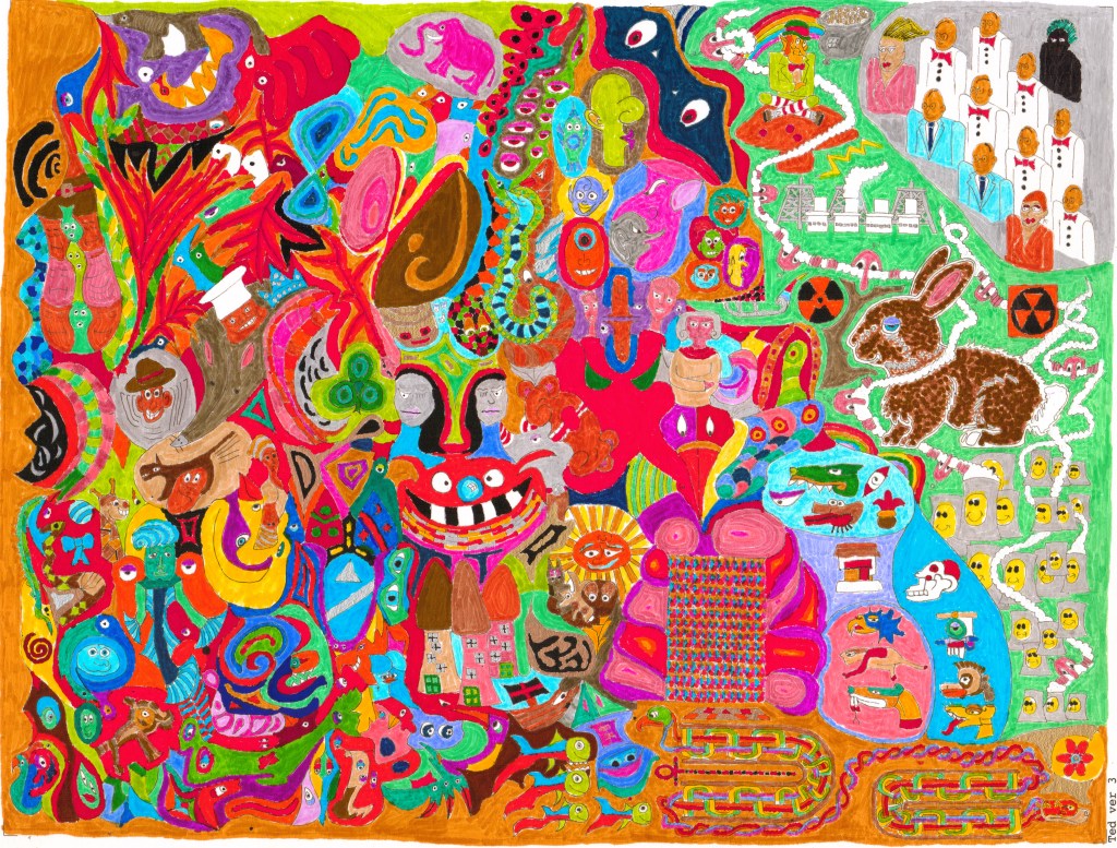
The latest artist showcase comes from Ted Silar, a writer (of music and literature), inventor and artist. In this piece, Ted talks about his ‘Rabbit Dreams’ series – which started as a doodle, but has become an experiment about line and colour.
Ted Silar, Rabbit Dreams 1
When did your interest in art/creating begin?
When I was a boy, I enjoyed reading comic books. (Rue the day my mother threw my collection out.) Not exactly an unconventional pastime. But it inspired me to want tobe a cartoonist. Which is a little more unconventional. I mean, comic-book reading didn’t inspire my buddies likewise. Why, I’m not sure, but I guess it was because I was never satisfied—I was always editing the cartoon—just like I was always editing the book I was reading, or the movie I was watching—in my head, the better to make italign with my own predilections.
But I never really got around to cartooning. The fact that I got glasses at 8 may have subconsciously re-directed my interests from the visual to the verbal and the aural. I seem to remember considering high art, too. But, while I liked high art of the traditional kind, high art in the time of my youth meant nothing if not Abstract Expressionism, which I did not like.Yes, I was one of those Philistines who thought, “A monkey could do that.” Funny how it turned out it was all a CIA plot, rendering all us clueless Philistines right by default! Indeed, it is funny what a grip modernism had on all of us. I wrote reams and reams of incomprehensible stream-of-consciousness poetry for years and years until I got wise, because incomprehensible stream-of-consciousness poetry was the thing one did. I write highly formal poetry nowadays.
Many years later, in San Francisco, I ran across this great book called The Zen of Seeing. Itshowed me a way out of the over-academic, over-intellectualized, fad-mad mentality, a way I could draw things realistically without “studying” how to draw. My college notebooks are full of rather faithful cartoon renditions of teachers and fellow students drawn with the Zen method. I also kept having these ideas, these concepts for works of art, and I was always trying to induce friends of mine who were trained artists to realize my concepts. No cigar of course. They wanted to do what they wanted to do.
Finally, with the advent of the 21st century, I said to hell with this. Do or die. I had this concept in mind—a picture so complex that it would have “scale”—that it would look different from different distances and perspectives. My original dream was to stand on a ladder next to a huge canvas, like Georges Seurat, only doodling away instead of dabbing away. I also imagined my huge canvas up on blocks and me rolling around doodling away beneath it on an old-fashioned, wooden mechanic’s creeper like a supine Michaelangelosplashing on the Sistine ceiling.
I soon discovered that a regular old sheet of 18 x 24 coldpress and a sagging barcalounger was more than sufficient. Do you realize how long it takes to fill up just one sheet with doodles? I don’t know about you, but it took me years.Yes, I didn’t work on it every day. But even if I had, I am sure it would have eaten up the days like gangbusters.
I found working on it almost therapeutic. Whenever I couldn’t concentrate on anything else, I could always take up my pad and doodle. It seemed to use a different part of my brain, a part of my brain where there was no pain, where everything was just jigsaw puzzles or motorcycle maintenance or something. Even the more difficult sections, sections that, unlike strictly-defined doodling, required care and pre-planning, like drawing Celtic knots or leprechauns, didn’t seem to cause me the kind of anxiety everything else could.
I used to think things like art therapy were just a bunch of psychobabble. Personal experience has re-vamped my view wholesale.
Ted Silar, Rabbit Dreams 2
What is your starting point for each piece?
My inspiration for Rabbit Dreams was totally conceptual. Long ago, I read James Gleick’s book, Chaos: Making a New Science, and, instead of inspiring me to make new science, it inspired me to make new art. While most of the book is about science and math, it does discuss art at a certain point. Gleick suggests that older art has more going for it than strict modernist art:
“A Beaux-Arts paragon like the Paris Opera has no scale because it has every scale. An observer seeing the building from any distance finds some detail that draws the eye. The composition changes as one approaches and new elements of the structure come into play.”
He compares the Paris Opera House to a New York skyscraper. The skyscraper, he contends, has no “scale.” It is so simple that it looks the same whether you look at it from near, far, or yonder. “Simple shapes are inhuman,” asserts Gleick. “They fail to resonate with the way nature organizes itself or with the way human perception sees the world.”
Such passages inspired me to create a “fractal,” “scalar” artwork, a work inspired by natural organization and human perception, a work of such complexity that it would look different on different scales.
That was my starting point—simple complexity. Later on, my doodling in my college notebooks gave me a way to work—I would simply pile little doodle upon little doodle until the whole, fortuitously, without malice aforethought, generated its own overall structures, structures you can only see if you step back.
It started out as just that and nothing more—a fractal/scalar doodle. But gradually,it became madness. I started in the lower left hand corner and worked up and right. As you can see, the lower left is the most abstract, formless, inchoate, doodlish. But at some point, as I worked my way to the right, the idea of the Rabbit came to me. The idea of all of this warped chaos emerging out of the dreams of a Rabbit. I thought of how the innocent little bunny-rabbit had plagued, almost destroyed Australia. All that mindless generation and creation and multiplication. Which reminded me of all that mindless human generation and creation and multiplication that has brought us to the present sorry state. At some point in the process, Fukushima blew up. And thus was the right third of the painting decided for me, fortuitously. The right third of the doodle had to become representational. I discovered I had worked my way backwards through time, first drawing the horrible, monstrous nightmare, and then, at the end of my process, drawing that which had first engendered it. The Rabbit. The mindless people. The nuclear generators. Fukushima. Kilroy.
After I had finished my 18 x 24 drawing, I had it scanned and printed out 8 1/2 by 11 prints on some nice, thick, but tragically absorbent paper. Step two. Coloring. Trying to figure out how to color the thing made me envy those cartoonists who have their own colorists. “You do it!” I would cry in my sleep. But, once again, I found this work therapeutic, choosing the pens, testing them out, choosing the colors, trying to keep in between the lines. In my first version, Rabbit Dreams I, I had two rules for coloring: Don’t put two areas of the same color next to each other and color things the color they should be (i.e., rabbit=brown, sky=blue). It wound up chaotic. The eye has trouble making sense of so many random colors all mixed promiscuously together. Rabbit Dreams II ended up with a preponderance of redness, and that seems easier on the eye. In Rabbit Dreams III and IV, I tried to limit the palette, in III to black and grey and white, and in IV to shades of purple that ended up looking mostly pink. Now I understood why movie directors use “color palette.”
Unfortunately, these versions only exist in digital form now. When I came back to my folder of inked-in prints after a few months, what did I find but the colored ink had all faded away into the paper. Thank goodness for scanning. Oh, well. Live and learn. I now know what kind of paper not to use.
In my recent, wholly digital versions, Rabbit Dreams V and VI, I went back to my first two rules, which should have resulted in a rainbow kaleidoscope of color, and yet somehow they came out predominantly orange-ish and blue-ish. Beats me why.
Ted Silar, Rabbit Dreams (Paint Net)
Who/what influences your work?
Chaos theory, of course, as I have already adumbrated. Also, I like pure, traditional designs, Islamic and East Indian carved latticework screens, Minoan pottery and fresco, Neolithic cave painting, Anasazi and Mimbres pottery, American Indian drawing, painting and design. There is a “who” behind this kind of art, but her name has always been “Anonymous.”
Ted Silar, Rabbit Dreams 3
What do you hope the viewer gets from your work?
There must be 200 eyes in Rabbit Dreams. I am not sure why. It reminds me of La Maesta, which I actually saw one time in person in Siena. All those figures’ eyes have these rich brown pupils staring out at you. It’s hypnotic. I think they are made of blobs of brown paint that stick out from the canvas kind of like what Van Gogh does with his flower petals. (I saw a show of Van Gogh flower paintings at the Met a long time ago, and, if you look at them from the side, they look like molded, three-dimensional relief maps of mountain ranges.) It is probably not an accident that theMaesta came to my mind, because it is a very complex painting, full from one end to the other with figures and decoration and illumination. Someday I would like to illuminate Rabbit Dreams with gold in classic Sienese fashion. I am joking, of course, although I did use gold- and silver-colored paint-pens on some of the versions, trying to get that illuminated effect.
I want all those eyes to hypnotize my viewers. I want the variety of colors and shapes to overwhelm them, inundate them, terrorize them, in a way reminiscent of Schiller’s concept of the sublime.
I also want them to appreciate the visual jokes. For the record, I would like to state that, although I did take the images of the rabbit and the leprechaun and the Celtic knots and the Aztec hieroglyphs off of the internet, I drew them freehand, Zen of Seeing–style, I did not trace them or copy and paste them.
Much as the work is obviously ridiculous, ludicrous, patently absurd, goofy, laughable, nevertheless, I hope that viewers at the same time see the deadly serious point.
I think Fukushima is the most horrible thing that has ever happened to the world. Ever. And the laughter that I express in the work is the insane laughter of utter despair and utter futility.
Ted Silar, Rabbit Dreams 4
What do you think about the term outsider art? Is there a term that you think works better?
Well, on the one hand, I am more than happy to fit into any category at all, as one of my biggest problemshas always been that people don’t know how to categorize me—and you need people to categorize you, or they just don‘t know what to make of you, and if they don’t know what to make of you, they end up standing there staring at you with glazed eyes like they just saw a hippogriff without a clue as to what a hippogriff is. I don’t blame them, I guess. My resume is somewhat diverse. I make outsider art; I write and play rock and roll, garage band, reggae, blues, soul, country, jazz, classical (among other genres);I write poetry, short stories, novels, literary criticism, history, essays (among other genres). I am a college professor, but I know the low-life, the working-man’s life, just as intimately. I have been a cab driver, a bricklayer, an auto-worker, a typist, a data enterer, a janitor, an accountant, a ticket-taker, a dishwasher, a chauffeur, a ditch-digger (among a raft of other bottom-of-the-feeding-chain jobs).
Such a polymorphous gallimaufry, it must be conceded, does not readily lend itself to abbreviation. (Another category I probably fit in is “People WhoUse PhrasesLike ‘Polymorphous Gallimaufry’ Too Much.”) So if people want to see me as “Outsider,” and suddenly that makes me (and more importantly, my work) clear and graspable and sensible and accessible to them, then “Outsider” I gladly shall be, and I am commissioning t-shirts to the effect as we speak.
On the other hand, “Outsider Art” is somebody else’s concept. (I would never have called it that. If it was up to me, I’d change the name every week: “Rebel Art,” “Whoozit Art,” “Art for Regular People” “Mxyzptlk Art,” “”Anti-anti-art,” “Art Linkletter.”)
Which reminds me of something. How I hate how my life,in this, the latter day,revolves ever more relentlessly around trying to resign myself to aligning myself with rules, standards, formats, concepts, made up by somebody else—with constantly struggling to fitmy round self into somebody else’s square holes. Take computers, for instance. (I’d rather not. I am one of those Luddites who is always on a computer,trying to make a mark, cut a shape on the air, find an audience, for god’s sake, on the only outlet available under the current dispensation.) I just spent the whole last year desperately funneling the free-floating, unbridled, untamed, rampant panoply of my art, my music, and my writing into the bone-crushing and mercilesswhalebone corsets, er, I mean “formats,” demanded by whoever it is who makes the confounded official internet rules thou shalt not break on pain of low hit-counts or worse.See me as I am, sitting there bleary-eyed in the wee-est of hours, shaking my head to clear it, trying to make sense of some egregiously counter-intuitive software no person in his or her right mind would ever have written that way were they not a reclusive, robotic Silicon Valley software hack laboring under a hard deadline. Unfortunately, the better I get at thinking and doing things this engineer’s way instead of my own way, the better I get at squeezing myself kicking and screaming into some faceless engineer’s grotesque, trackless, feckless, clueless Grand Guignol of a mindscape. In other words, the better I get at operating the stupid software, the more my own unique personality rots into little dripping pools of palpitating deracinated sludge.
On the third hand, there is the vexing question of whether you can be an outsider artist when you are a college professor with a Ph.D.
I think that, when most people try to envision “outsider artist,” something involving the Ozarks and learning disabilities often comes to the fore. While I like the kind of art that comes out of Ozarks and learning disabilities a lot, I do think that maybe mine could stand rightfully beside it, if given a chance.
I am, in my defense, though, an English professor, not an art professor. More to the point, I am an adjunct professor, which is an outsider if there ever was one. A form of madness.
And I’m 64 and only starting now. And I have no connections in the art biz whatsoever. And I never took a drawing or painting or any kind of art class. Although I did take art history courses. So I can talk the art history talk a bit.
I feel like an outsider, that’s for sure. That ought to be enough, I should think.
Ted Silar, Rabbit Dreams (Paint Net)
What are you working on at the moment?
I have been working with Paint.net, sucking the color out of all my drawings, tracing out all the outlines in black, and making a coloring book. That way I don’t have to do the coloring!
I am also creating digital versions of my work. Rabbit Dreams V and VI are digital coloring book versions colored in using Paint.
Digital painting is a mixed blessing. On the bright side, you can fix mistakes easily, clean everything and sharpen everything up, keep earlier drafts, etc. Also, you can get an almost infinite series of “color gradients,” or subtle variations in color. You can also sample the color of any picture you can find. I have been enjoying looking up a photo of a green lizard or a red robin or a lapis lazuli necklace or a chestnut Rembrandt background, sampling the color, and pouring it into a “puzzle-piece” segment of my coloring book.
On the dark side, Paint.net is very absolute. When you fill in an area with color, it is utterly and completely that color. No variation from one end to the other. None of the infinite gradations you can effect with pigment within an area of basically the same tint.
Likewise, you can’t get physical texture: everything is flat. And some of my favorite colors are impossible. Silver and gold come out dull grey and greenish-yellow. Whereas, in the snail world, you can buy shiny, glittering gold and silver paint at Walmart and illuminate your real-life painting—like a Sienese master!—if you so desire.
One other really annoying thing about Paint.net.
As I have said, I start out with coloring-book style, jigsaw-puzzle-style outlines, black outlines. But when I accidentally touch a black outline or area with that paint-bucket tool, I have to wait for half an hour while that little “Computer-At-Work” circle churns away, slowly re-coloring every single black line and area in the composition. Watch out for the black! I have to keep reminding myself. And then I always forget. And then I have to go out for a sandwich while it churns. Oh, well.
Ted Silar, Rabbit Dreams (Paint Net Negative)
Where do you see your work taking you in the future?
First of all, I’d like to paint in the large 18 x 24 drawing of Rabbit Dreams, using oil paint or acrylic on paper, something substantial. But, as usual, I can’t decide on the color scheme. When I just put any color anywhere, as in Rabbit Dreams I, it’s just chaos, the barrage of different colors makes no sense to the eye. It’s a visual nightmare. Which is kind of what it was supposed to be I guess. But then I can’t make up my mind on how to limit the color palette, either, as inRDII, III, and IV (and to some extent, V and VI),none of which I find entirely satisfactory.
Things like Rabbit Dreams take so long. Intricate designs like that just seem to take forever.I would like to find a way to speed up the process. The thing is,the next thing I want to do is to start drawing human figures, using Zen of Seeing techniques.I can draw anything if I have enough time. But I can’t draw representational figures facilely. And so, there goes huge blocks of time again. When you are my age, time being, as they say, of the essence, you don’t want to devote too much of it to hopeless causes or endless projects.
In particular, I am thinking of making a big doodle 18 x 24 drawing along the same lines as Rabbit Dreams, but all of faces taken from real life. I imagine sitting by the side of a well-traveled street and doing one quick drawing of a face after another. I will probably have to scale back my aspirations, as usual, when push comes to shove. But something along that line is my plan, at any rate.
I would also like to do some realistic oil paintings, using classic techniques, of unconventional subjects. I have two ideas right now. There is a trailer in a trailer park I like, and would like to immortalize. And I would like to paint a bunch of very old people visiting a very very old person in an old folk’s home and call it “Mother’s Day.”
In this post, writer Nick Moss responds to Cornelia Parker’s current installation at Frith Street Gallery and reflects on how, in opposition to Parker’s ‘insider art’ – which feeds us messages of unquestioned assumption – outsider art has the power to contain the multitude of voices that go unheard in the art world.
The first reaction of anyone who sees themselves as “progressive” when first encountering Cornelia Parker’s current installation at Frith Street Gallery (28 April 2017-21 June 2017) will doubtless be euphoric. All the right boxes are ticked- it’s a mocked-up nightmare of the USA under President Donald Trump. In 2016 Parker was commissioned by the Metropolitan Museum of Art to create a site-specific installation for the museum’s roof garden. The ensuing work, Transitional Object (PsychoBarn) was apparently inspired by the paintings of Edward Hopper and by the Bates family’s mansion from Alfred Hitchcock’s 1960 film Psycho. According to the press blurb “PsychoBarn loomed on the city’s skyline as a harbinger of things to come – signalling that all was not so well in the American psyche.”
Parker visited New York at the end of October 2016 to give lectures about the PsychoBarn prior to its de-installation. Its closing date was Halloween, “the old festival of All Saint’s Eve, which has been famously elevated in the USA to a theatrical celebration far removed from its folkloric and religious origins.” Parker and her husband used their iPhones to film people dressed up on the streets. The resulting video American Gothic 2017 “captures ghoulish revellers having their last hurrah, mingling with the crowds of the un-dead. On All Hallows night in Greenwich Village every American archetype, good and bad, seemed to be out promenading the sidewalks, from superheroes, vampires, clowns, ghouls, trolls, Freddie Krueger and Hannibal Lecter, Uncle Sam, Dorothy and the characters from The Wizard of Oz.” The scenes are displayed in slow motion and accompanied by a slowed-down location soundtrack, which provides a low drone as background noise. On a 4th screen is footage of Trump supporters outside Trump Towers, celebrating his election. This is shown in real time, but without sound.
Cornelia Parker, PsychoBarn (Image courtesy of wired.com)
I have no axe to grind against Cornelia Parker. I have been moved by some of her previous work-Anti-Mass particularly. This is therefore not a critique of her work per se. It is, however, written as Parker takes up her role as 2017 official election artist, and reflects therefore, necessarily, on the politics inherent to American Gothic, and what they say about “progressives’” responses to the Trump election.
The first thing to note is that, were the Halloween scenes to be played in real time they would show happy, pissed revellers looking to dress up and party. This is no pre-apocalyptic “last hurrah” , no mournful parade-it’s a time when the streets are taken over by ordinary people, masking themselves and taking advantage of their anonymity to get absolutely wasted ! In slowing down the footage Parker is passing judgement on the revellers purported departure from the “folkloric and religious origins” of the festival. I’m always bemused by the fact that people who describe themselves using that mealy-mouthed epithet “progressive” stop seeing the liberatory element of the abandonment of “tradition”, when said liberation involves working class people behaving riotously in the street. George Orwell , in Down and Out in Paris and London, contends that “Fear of the mob is a superstitious fear. It is based on the idea that there is some mysterious, fundamental difference between rich and poor, as though they were two different races.” Parker manipulates her footage of the crowd and in doing so her fear of that crowd (and eo ipso that of her presumed audience) is made apparent.
So the procession of ghouls is manipulated to meet the need of another crowd-that embodied in disillusioned progressive opinion- who want to see their passive despair reflected back at them in the comfort of the gallery space. And on the 4th screen they get to stare open-mouthed at the crowds of ecstatic Trump supporters. As already noted, this footage is silent. This is a shame-as we see groups such as Blacks for Trump and Latinos For Trump actively explaining their motivations to the camera, but are denied the chance to hear them. Presumably we are supposed to be already part of a consensus that they have nothing to say worth hearing. It is worth noting though, that the primary claim of the working class and poor people who voted for Trump, for Le Pen, for Brexit, was that thy were “the forgotten”-the casualties of deindustrialisation whose voices now counted for nothing. A working class vote for A right wing politics that in the long run are against the voters’ interests is,in essence, an expression of powerlessness. It is a gesture against the political Establishment, for sure, but more than that, it demonstrates a belief that change can no longer be effected by solidarity-that you can only , for instance,get new housing stock by driving out the family next door. It is the beginning of the war of the poor against the poor. Such being the case, we might want to consider how “progressive” is an artwork that actively erases the voices of those who are already “the forgotten.”
What we have then is the opposite of what first appearances lead us to believe. Once all of the manipulation of footage, all the technological mediation is stripped away, the 4 screens show the raucous celebrations of Trump supporters, and the Halloween debaucheries of the costumed revellers of New York. What we have in fact is a 4 screen technological effacement of the voice of the working class, a 4 screen installation that doesn’t challenge its anticipated audience , doesn’t provoke, but tells them just what they want to hear. Trump is bad, and these are frightening times. We can agree. We can accept that it’s not Cornelia Parker’s role to point us towards a way out of the Bad Times. But we should surely expect more from art than a (perhaps unconscious) reproduction of Bourdieu’s “complicitous silence”-in this case in fact a “complicitous silencing.”
As much as we might flinch at the difficulties inherent in the use of the descriptor “outsider art”, we might best see the logic of the term in relation to those art forms antonymous to it. There is a sense in which much art now-the Hirsts, the Quinns etc-by virtue of their cost, their materials, their intended audience, might best be called “oligarch art.” But if outsider art has an antonymous counterpart art form, then that must be, logically, something like an “insider art”-and American Gothic is insider art paradeigma. It does nothing other than offer platitudes to an audience who will already agree with the point it so clumsily makes. Outsider art, then, must be the opposite of this. It will contain the multitude of voices that go unheard in the art world. The loud, the ugly, the distressed, the vicious,as well as the sublime, the beautiful, the soothing. It will admit all that is excluded from the discourse of the mainstream. It may do this therapeutically, as pharmakon, as celebration. What it will not do is silence, look away from or exclude. In that sense then, as opposition to insider art, we might still make positive usage of the term.