This is the final installment in a series of posts introducing American artist Curtis Fairley. In this post, collector and supporter of Fairley’s work, George Lawrence, will focus on Fairley’s depictions of animals and inventions.
Fairley and animals
Kate Davey: Fairley’s representations of animals are also very interesting. They are almost text-book diagrams of a range of creatures: star fish, cats, deer. These works differ slightly from his naval images, as they are less reliant on descriptive text. Where do you think this fascination with drawing animals came from?
George Lawrence: Yes, I love the animal drawings. And most of them are very simple. I wish I had asked him more about them, but since we never spoke specifically about it, I can’t really say much about his impulse for drawing them.
.
A few of them are placed in settings, so I suppose that those drawings could be documentation of life experiences, like the navy images. One good example of this is the drawing he titled‘Pumpies in the Breakwaters–Flying Fish’ (Image 30).This is a scene he would have likely observed on one or more of his many sea voyages. I have searched for a fish with a name or nickname like‘pumpies’ but I haven’t found one yet. Maybe one of your readers has an idea? The text at the bottom of the drawing reads‘When wings gets Dry Fall back in the water.’ I especially like the graphic quality of this drawing with the regular pattern and repeating shapes against a simple background.
Image 30 – Pumpies in the Breakwaters – Flying Fish
A few of the other animal drawings with settings look like they may have been memories of travels or shore-leave experiences. One of these (Image 31) appears to be a farm scene with a farmer operating some kind of mechanized feeder for cows or pigs. This mechanism could also have been an idea for an invention. It looks like the date at the top reads ‘1987′ but the rest of the text is not legible. Another drawing (Image 32) shows a grouping of birds above a drawing of an elephant with a hay bail, each in a framed background. The text on the page reads‘Drinking HO2(sic) Birds snack and.. Elephant Break Bail.’Maybe these were memories of a trip to the zoo.
Other drawings simply feature the animal isolated in a decorative border (Images 33 – 36). Perhaps these drawings were done just for fun– or for Fairley to see how much he could recall about a creature from memory. Although the cats could easily have been Lower East Side residents and convenient models.
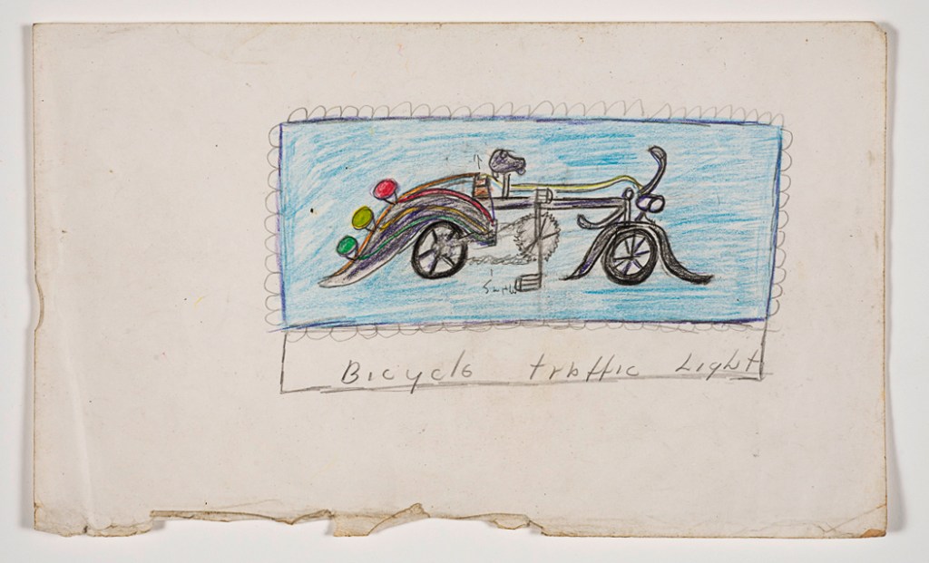
KD: A few of Fairley’s‘invention’ drawings focus on a traffic light bicycle and windmills. He has drawn the traffic light bicycle and variations of a windmill several times, sometimes presenting them with explanatory text, and sometimes just as a visual. It’s interesting, as inventions are often a common theme in work created by outsider artists. What relation do you think these invention drawings have to Fairley’s life– was he a keen cyclist? Did he have knowledge of the workings of windmills? Or are these pure imaginative representations?
.
GL: This is another instance where I don’t have enough information to give you a proper answer, Kate. Unfortunately, we never spoke directly about the invention drawings. I have wondered about whether, if I had known him longer I would have seen more types of inventions. The examples that I have may be the ideas he was working on during the period of time that I knew him.
.
I doubt if Fairley was a cyclist at the time I knew him, but he would have seen people biking everyday on the streets of the Lower East Side. And he would certainly have seen, as I did, bike messengers speeding deftly and sometimes dangerously through Manhattan traffic. Perhaps close encounters between cars and bikes were the inspiration for Fairley’s‘Bicycle traffic Light’ invention (Image 37). It looks like it is designed to alert people behind the bike as to whether the cyclist is speeding up, slowing down or stopping.
Image 37 – Bicycle Traffic Light
The other invention that Fairley explored in several drawings was a windmill-powered outdoor oven (Image 38). Unlike the Bicycle traffic light, this invention is pictured in a sunny field next to a bordered bed of flowers– a setting that looks far from the streets of Manhattan. The text on the drawing is, conveniently, a recipe for Parker House Rolls.
Image 38 – Windmill Powered Oven
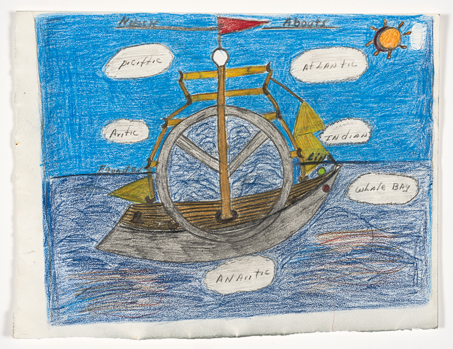
The drawing in image 39 features both inventions, the windmill-oven and the traffic light bike together on the same page.An interesting detail to note is the circular gear-like symbol that has been added to the right of the oven. A scaled-down version of this symbol also appears next to the bicycle seat below. I’m not sure what this symbol represented to Fairley but I think it may have been important. A much larger version of this same shape, intersected by the mast of the ship, also appears in the drawing‘Knock Abouts’ that I discussed at the beginning of this interview (Image 40). We also see a shape at the top of the ship’s mast that looks like the light bulb from the windmill-oven. It makes me wonder if the symbol might refer to the use of an alternative energy source, and if what I thought was a fantasy drawing of a ship is actually a representation of a invention or a design for a prototype ship. Again– I would love to hear other ideas.
This is the final installment of a four part series focusing on American artist Curtis Fairley. To read the previous posts in the series, please visit the links below:
This is the third post in a series introducing artist Curtis Fairley through interviews with George Lawrence, who is a collector and supporter of Fairley’s work. This post focuses on Fairley’s representations of every day life, and how these are intertwined with his life in the US Navy.
4. Fairley and everyday life
Kate Davey: His naval works certainly are incredibly interesting, and go some of the way to putting Fairley at certain points on the map at various points in his life. Some of his other work– the work that appears more‘everyday’ actually still relates to his life in the Navy. What are your thoughts on these more everyday works? Is it a desire of Fairley’s to document everything he sees and experiences, from the historically important to the relatively‘mundane’?
.
George Lawrence: There are very few of Fairley’s drawings in my collection that I would categorize as ‘everyday’ unless you qualify it ‘everyday in the Navy.’ I think that the years of military service dominated his thoughts and influenced the subject matter of almost all of his artwork. When you think about it, Fairley entered the Navy in 1945 at the age of 18 and then spent the next 31 years in active service and the reserves. It’s easy to see why the main focus of his artwork would be fixed on those years.
.
Apparently, Fairley’s days were filled with a wide variety of duties and tasks. On the back of one of his drawings he made a list of the different skills and positions that he practiced over the years, some of which he has rated according to how well he performed them, in a kind of graphic resume (Image 19).
Image 19
The over 100 listings are almost all jobs and positions that he held in the Navy. The ones he has rated “Outstanding” and “Excellent” include Galley, Ward Room, Pantry man, Baker, Butcher, Gunner, Loader , Sighter. Jobs rated as “Average” include Shore Patrol, Atomic Attack, Pressure tank, Landing parties and Scullery.
.
From what I have read about the Navy in the 1940’s, African-American servicemen were mostly restricted to job postings such as Steward or Mess Attendant. This appears to have been the case for Curtis when he joined in 1945. However, formal racial segregation in the armed forces was ended by President Truman in 1948 and from Fairley’s listing it appears that his opportunities may have expanded over the years to include other duties and responsibilities.
.
Nevertheless, it appears that he took great pride in his position in food preparation and as cook, baker pantry man and butcher. Many of the ‘everyday’ images that you mention, Kate, look like they are representations of some of the meals and dishes that he prepared in the service. One of my favorite images is ‘Stuffed tomatoes Salads w/ Russian Dressing’ (Image 20).
It must have been a meal for officers because it includes “Baked Stuffed Potatoes with grated cheese” and “Fillet Mignon Steaks with mushrooms.”
.
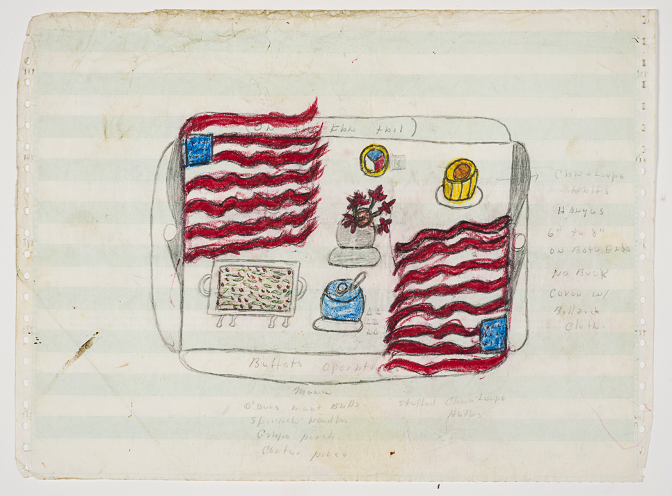
Other drawings illustrate complete table settings. Image 21 is a drawing of a table draped with two American flags, set with a variety of dishes and a centerpiece of flowers. A title in the decorative border reads “On the Fan Tail” and “Buffet Operations.” The description below the drawing reads “Menu, O’Durs(sic) Meat Balls, Spinach Noodles, Grape Punch, Stuffed Cantaloupe Halves and a Center piece.”(If you google “On the Fan Tail” one of the first results is the site for the USS Intrepid Museum and a photo of a table on the rear deck of the ship with the caption:“Begin your event on Intrepid’s Fantail, located at the westernmost point of the ship. It is an ideal setting for outdoor cocktails before moving upstairs to the Great Hall for dinner.”)
Image 21
Another of Curtis’ decorative food illustrations is of a platter of Blue Fish (literally) “Baked Japan Style” (Image 22). This image is striking in its simplicity and bold colors.
Image 22 – Baked Japan Style
All three of these drawings (Images 19, 20 and 21) are done on the backs of found computer paper – the perforated edge, green and white striped kind that was common at that time.
.
Another drawing reveals Fairley’s knowledge and experience in food preparation. Image 23 shows two colorful cuts of meat, along with detail sketches of blue government inspection stamps, cutting knives and a meat hook. Notes on the drawing offer helpful details like “Cut across the grain after cooked” and“2% fats– use for flavor.”
Image 23
Some of the most powerful of these ‘Everyday in the Navy’ images are of isolated objects or symbols that seem to have a special meaning to Curtis.
.
One example is a drawing of a cracked ship’s bell positioned above a strange rendering of a ship’s wheel (Image 24). The two terracotta colored graphic shapes are isolated against a coral-colored background with a decorative border. A lever or control of some kind floats to the right of the wheel. The text on the images is carefully placed in outlined white boxes or arranged against the coral backdrop. The cryptic question posed within the text boxes reads: “Who shine the bell off duites(sic) – while the bell crack was crack?” Under the image of the bell is the label, “U.S.N. Bridge.” The words “ON– Bridge” are written next to the ship’s wheel. At the bottom of the page in parentheses is the inscription: “(Change the Days and Time).”
Image 24 – Change the Days and Time
It’s hard not to conclude that this drawing is meant to convey a symbolic or allegorical meaning beyond the obvious words and images. I would love to hear possible interpretations from your readers, Kate.
Image 25
Image 26 – A Ship’s CompassImage 27 – Engine Order Telegraph
Image 25 shows a drawing of what I have interpreted to be either a ship’s compass (Image 26) or an ‘engine order telegraph’ (Image 27). Notes written around the image list various engine orders: “Full Speed Ahead, Full Speed Back” as well as names of oceans: “Atlantic, Pacific, Indian, Artic.”Some of the notes give information about Curtis’ experiences: “The longest at sea– Six months, The shortest– 2 hours.” A descriptive/poetic note appears at the top of the drawing: “When ship gets lose(sic) what Happen– The Navigator shoot the moon or sun and fine(sic) his true courses.”
.
There are drawings that don’t seem to be directly connected to Curtis’ Navy life. Some of these are images of places where he may have lived or traveled. Two striking images from the travel drawings are of highways: the Santa Anna freeway (Image 28) and a highway through the Florida Everglades (Image 29). In both drawings Landry uses the full width of his paper so that the roadways stretch across the page and careen off either end.
Image 28 – St Anna FreewayImage 29 – Florida Everglades
The Santa Ana Freeway (Clayton labels it “St Anna Freeway”) in Fairley’s drawing is interrupted only by ‘trouble’ signs and light posts. In semi-circular landscaped areas on either side of the highway are a few lonely tulips or daffodils.
.
The image of the Florida Everglades roadway is busy with all kinds of creatures crossing the lanes in the median and on the shoulder. Serpent shaped creatures with many legs (alligators?) wander across the roadway and a small creature like a miniature tank (armadillo?) appears on the grassy median and shoulder. Two ominous dark structures appear to be giant gas pumps loom over the lanes in either direction. The pumps have signs reading “Last Change.” I’m not sure if this was meant to be ‘Last Chance’ but either way I think a driver would get the point.
.
Regarding the last part of your question, Kate, about whether Fairley recorded everything he saw or if he focused more on images that were important to his life, I think I would choose the latter as the motivation for his artwork. For instance there are very few drawings that depict the Manhattan streets where Curtis was living at the time that I knew him. The scenes and subjects of his artwork were largely drawn from his Navy life and must have represented his most memorable and meaningful life experiences. In depicting some of those experiences, as in the drawing of the cracked bell and the ship’s wheel, he sometimes seems to hint at deeper meanings and interpretations.
This is the second part in a series focusing on the work of Curtis Fairley through an interview with George Lawrence. This post looks in detail at Fairley’s insightful interpretations of his life in the US Navy.
3. Fairley and the naval works
Kate Davey: Fairley’s work expands across a range of subject matter– from images of food preparation and recipes, to animals and nature, to inventions, but perhaps his most intriguing work is that which relates to his life in the US Navy. His depictions of life in the Navy, including submarine bases, Navy ships, self-portraits in uniform, and specific Naval missions are fascinating both from an aesthetic and historical perspective. Unlike many of the most well-known outsider artists, for example Madge Gill, Martin Ramirez or Henry Darger, Fairley doesn’t conjure a new reality with his work. Instead, his work is almost a rigorous documentation of a certain period in his life. You’ve done some research into his‘Navy’ works, could you tell us a bit more about what you have discovered during this research, and share with us some of your insight into these interesting pieces?
.
George Lawrence: You’re right Kate – it seems that Fairley’s time in the Navy carved the memories that were the most vivid in his mind. He was able to put them down on paper many years later with amazing detail.
.
I am not an expert on the US Navy, but as I said earlier, I was able to obtain Fairley’s naval service record from Freedom of Information Act documents. It shows that he entered the Navy at Birmingham, Alabama in December of 1945. He would have just turned 18 years old. World War II had just ended in August of that year. From that date, he served a total of 31 years, from 1945 to 1966 in active duty, and then from 1966 to 1976 in the Naval Reserve. It makes sense that the Navy experience would have been the central subject of his “memory drawings.”
.
Fairley’s rank is listed as “MS1” which stands for “Mess Attendant Specialist Petty Officer First Class.” Among the decorations and awards listed in his record are the Armed Forces Expeditionary Medal (Vietnam), The World War II Victory Medal, the Asiatic-Pacific Campaign Medal and the European-African-Middle Eastern Campaign Medal.
.
Two of the drawings are self-portraits in Navy uniform. In both drawings Fairley’s uniform shows the three red chevrons on the right arm that indicate ‘Petty Officer First Class.’ The ‘SP’ on the hat and left armband indicate that he was assigned to ‘Shore Patrol’ duty.
Image 6 – Curtis Fairley, Self Portrait
In Image 6 Fairley lists some of the duties associated with the Shore Patrol position. (note: Fairley often uses the word “and” for “a”)
.
“Never strike and mate on his head.
Never sky larking
Always walk in pairs
No drinking alcohol
Never use hand cuffs on and mate
45 pistol std(starboard) side… nite stick on port side”
Image 7 – Curtis Fairley, Self Portrait
Image 7 has some humorous and informative notes about his demanding job as a mess attendant, posed in a question-answer form.
.
“How many mates did you starve aboard ship during the war? Ans(answer)– None.
What was the largest amount you cook for?– 1,100
Small amount?–25
The medium amount?– 150”
.
These two drawings demonstrate the amount of information and historical detail that can be gleaned from many of Curtis Fairley’s sketches. I’m sure that someone with a more thorough knowledge of the Navy would find details that I have missed.
.
From 1945 to 1966 Landry served on 11 different ships according to the notes in his drawings. I was able to identify eight of them from his naval record – four aircraft carriers: USS Philippine Sea, USS Leyte, USS Kearsarge and USS Sicily; one submarine tender, USS Gilmore; two guided missile cruisers, USS Providence and USS Topeka; and one destroyer tender, USS Frontier. His longest posting was with the USS Gilmore from 1950 to 1957.
Image 8 – Curtis Fairley, USS Philippine Sea
Fairley’s initial assignment in 1947 was aboard the aircraft carrier USS Philippine Sea whose first mission was as part of a major expedition to Antarctica called ‘Operation Highjump.’ Image 8 may be his drawing of that aircraft carrier because of the notes at the top of the drawing that read ‘Plank Owner’ and ‘Holy Stone Ship.’ The naval term ‘Plank Owner’ indicates that Fairley was a member of the first crew aboard a newly commissioned ship (USS Philippine Sea was commissioned in 1946) and ‘Holy Stone Ship’ is a term for a ship with a wooden (teak) deck. Apparently most US Navy WWII aircraft carriers were still being built with wooden decks.
.
Other notes on the drawing include a listing of the oceans that he has crossed:
.
“Paciffic (sic) 5 years, Atlantic 2 years, Arctic, An Arctic (sic), Indian.”
.
And the destination of Operation Highjump: “South Pole Operations, Little America”
The circumstances surrounding “Operation Highjump” deserve a mention. One year after the end of the Second World War, thirteen Navy ships, multiple aircraft and 4,700 men took part in a US Navy expedition to Antarctica led by Rear Admiral Richard E. Byrd. The official objectives of the mission included establishing an Antarctic research base, testing equipment in frigid conditions, and extending US sovereignty over the Antarctic continent. However, a quick internet search will reveal a wealth of websites that put forth theories of more sinister objectives, involving everything from hunting down a secret Nazi military base to UFO sightings and encounters with flying saucers!
.
Unfortunately, none of Fairley’s drawings offer clues to these mysteries. However, one drawing (Image 9) illustrates an interesting initiation ceremony that took place on board when the USS Philippine Sea crossed the equator en route to Antarctica.
Image 9 – Curtis Fairley, Crossing the Equator
Fairley illustrates the ceremony with lots of explanatory notes in the margins. Sailors who had never crossed the equator were considered ‘Polywogs’ and had to undergo a day-long ordeal in order to become ‘Shell Backs.’ The Polywogs in the center, wearing only their underwear, are on an area of the deck bearing the note “oil on deck.” The Shell Backs, in uniform, form a whipping line on either side. A note next to one Shell Back reads “wipping (sic) bags stuffed with sand.”
.
Fairley gives a description of the day’s events for the unfortunate Polywogs
(note: spelling is as written):
.
“Menu-none, No Eating, No Drinking, No Skylarking, No Smokeing, No Sick Bay– Starts at sun rises until sun sets– Do none of the things above– Uniform of today, drawers, bottoms–
No.1 Elevator departing to the wipping line– En route to the South Pole via Panama Canal locks.”
.
The text at the center of the drawing describes the expedition:
.
“Equator Lines, One half of the world to the bottom, Adm Byrd expedition en route to the South Pole now name Little America-History, On board U.S.S. Philippine Sea.” The tank filled with green water at the top right is labeled “Body Cooling Systems.”
.
From this dramatic entry into Navy life, Mr. Fairley proceeded to serve on a succession of Navy ships. Some of them found their way into his drawings.
Image 10 – Curtis Fairley, USS Gilmore Pick Up Pilot Down the Mississippi River
Image 10 has the title ‘USS Gilmore Pick Up Pilot Down the Mississippi River.’ The USS Gilmore was a Submarine Tender, a type of ship that supplies and supports submarines. Landry was a crewman on this ship for 7 years. Not surprisingly a number of the drawings illustrate this involvement with the submarine force. Titled ‘Home of Sub Force, Groton, Conn,’ image 11 shows the bay with what looks like two subs docked and one in a kind of dry-dock. Mr. Fairley must have spent some time in the area because he also created drawings of two of the nearby landmarks.
Image 11 – Curtis Fairley, Home of the Sub Force Groton Conn
I was able to identify Fairley’s memory drawing of a lighthouse as the Avery Point Lighthouse (Image 12) because the drawing captures the characteristics well enough that recognized it in a photo that I found of the actual lighthouse, still standing on Avery Point in Groton (Image 13). The mysterious eclipsing sun that he added to the scene appears in several of his drawings. It was also easy to identify the Escape Training Tower at Groton from Fairley’s simple sketch (Image 14). The tower was in use from 1930 to 1994 to train scuba divers to access or egress a submarine during special operations (Image 15). The tower has since been demolished.
Image 12 – Curtis Fairley’s Lighthouse
Image 13 – Avery Point LighthouseImage 14 – Curtis Fairley, Groton ConnImage 15 – Escape Training Tower
Recently in my research I discovered that two of the ships, the USS Providence and the USS Topeka were equipped to fire surface-to-air missiles. Landry served on those ships during the Vietnam War, from 1959 until 1965. Looking back, I think this explains one of my in-person encounters with Mr. Fairley.
.
Seeing him at work on the street one day, I noticed that he was intent on a drawing that a first glance seemed abstract – fiercely drawn with intense strokes – blendings of red, yellow and black. Looking closer I saw that the drawing was of a missile firing as if viewed from above. It was difficult to imagine how that point of view would have been possible. The following day I happened to see him again. He had produced another drawing that was almost identical to the first powerful image, as if he was still immersed in his memory of the event (Images 16 and 17).
.
Not long ago I came across the photo in image 18 of the firing of a Tomahawk missile from the deck of the USS Farragut. The similarities to Fairley’s drawing are remarkable, including the circular red markings on the deck indicating the missile area.
In a new series on the blog, I will be asking George Lawrence about his collection of artwork created by a homeless U.S. Navy veteran whom he met whilst living and working in New York City. Lawrence has recently been delving deeper into the works he purchased from the artist in the late 1980’s, and into the life of the artist himself, by studying the biographical information included in the images and text of the drawings. . Lawrence has discovered the identity of the artist through public naval records but has not been able to locate or contact the man, who would be over 90 years old if he is still living.
.
This first post will introduce Lawrence’s interactions with Fairley, with subsequent posts looking in more detail at the content and style of Fairley’s work.
1. Meeting Curtis Fairley
Kate Davey: Could you tell me about the first time you saw Curtis’ work? What was the initial impact it had on you?
.
George Lawrence: I first encountered Curtis Fairley around 1987 on the Lower East Side of New York City. I was working as a draftsman in a design office nearby. That area of the Bowery in the late 1980’s was a mix of neglected properties, Lower East Side art scene, and encroaching gentrification. Many of the local buildings were being bought and renovated by small businesses, artists and speculators. Nearby was a homeless shelter and a few blocks away was the rock club, CBGB’s.
.
At the time I met him, Mr. Fairley was living at the shelter, but he spent his days writing and drawing, using the windshield or hood of a parked car as a drawing board. He worked with the regularity and commitment of a full-time employee. He was African-American, probably in his sixties and usually dressed in khaki pants and shirt and a knit cap.
Image 1– 317 Bowery, NYC, The Men’s Shelter building on the right, next to the old Amato Opera Building.(Photo grab from Google Earth Street View, circa 2015)
Mr. Fairley used pencil, chalk, colored pencil and crayon on paper that he collected from the neighborhood trash. He often drew on both sides of his pages. Some of the drawings were done on the green and white striped computer paper that was then the standard. Other drawings were sketched on the backs of discarded business letters.
.
I have always had a love for the work of folk artists and self-taught artists, so when I saw Mr. Fairley’s drawings I was fascinated by them and thought I recognized the raw work of a true ‘outsider artist,’ although I can’t recall if I knew that term at the time. I had taken some art classes and art history courses as part of my architectural degree and several of my friends were artists trying to find their place in the Lower East Side art scene. Mr. Fairley’s drawings had a quality of uninhibited originality that I didn’t see or feel in the more studied and self-conscious art I saw in the galleries. Coincidentally, I had recently been living in Brooklyn where my Puerto Rican landlord spent his spare time making art, using leftover house paint and scraps of Masonite. He would hang the paintings, which also looked like scenes from his childhood in Puerto Rico, in the hallways of the small apartment building. I admired in them the same vibrant, raw quality that I later saw in Mr. Fairley’s work.
.
Over the course of a year or so I purchased about 50 drawings from Mr. Fairley and periodically I offered him paper and colored pencils, which he graciously accepted but did not seem to need. “I can find all the paper I need,” he told me. The drawings are illustrations of memories from his life. Common subjects include a variety of Navy ships, submarines, details of daily life, illustrated recipes, animals, exotic destinations and curious inventions. I was amazed by the intricacy of the illustrations and the detailed descriptive notes on many of the drawings.
Image 2– One of Fairley’s ship drawings– titled‘Knock Abouts’ at the top of the drawing. I think this may be a fantasty drawing and not a representation of an actual ship. The horizon is labelled as the‘Equator Line’ and word balloons hold the names of seas and oceans. From my research‘knock abouts’ is a term for a small sailboat that could be handled by one person. I’m not sure why he would have applied the term to this image of a large complex ship.
Image 3– One of the first drawings I purchased from Fairley. This one is titled‘Knotsberry(sic) Farms’ in the decorative border below. It features a chicken perched in a tree, surrounded on the grass below by chicks hatching out of eggs. A border below the tree reads‘Oh! Oh! What Happen.’ Knot’s Berry Farm is an amusement park that still exists in Buena Park, California. In a search on the web I found a comment thread with people reminiscing about the chickens that used to run loose on the grounds of the Knott’s Berry Farm restaurant in the 1960s.
I think that on some level I envied Mr. Fairley’s artistic spontaneity and his innate urge to draw whatever came into his mind. Of course I have no idea if that is how he experienced his life and I don’t assume to understand or diminish what he must have gone through, living on the street. Our conversations never progressed beyond a few halting sentences and I never felt comfortable enough to discuss with him how he had come to be homeless. There was, at the time, a movement to show the work of homeless artists at some of the local galleries, so I asked Mr. Fairley if he would be interested in showing his work. As I recall, he shook his head and said something like: “This is not art, these are just my memories.”
2. Fairley and the intermediate years
KD: When was the last time you can remember seeing Curtis in person?
.
GL: I don’t recall the last time I saw Mr. Fairley on the street outside my workplace. It would have been sometime in 1989. Over the course of a few days or weeks I noticed his absence. Someone told me that the nearby homeless shelter had been closed and was undergoing renovations. I assumed that the residents had moved to another shelter, but I never went so far as to investigate where in the city the other shelter might be, or what had become of Mr. Fairley.
.
Around the same time that I lost track of Mr. Fairley, I had begun to make plans to leave New York. Much of my activity outside of work revolved around advocacy work with environmental groups in the city. A friend connected me with a group who were planning a coast to coast walk across the United States called the Global Walk for Livable World. I began to attend the local meetings and decided to participate in the walk as a way of leaving New York and discovering a new “path” for myself. So I quit my job, and in February of 1990 I flew to Los Angeles and, with about 100 other activists, began a nine-month walk back to New York. We walked mainly along state highways and camped in tents at sites ranging from college campuses to state parks to private farms. We coordinated as much as possible with local environmental groups along the way to hold public events highlighting the challenges to the environment specific to that community, along with promoting environmentally sustainable choices and lifestyles.
Image 4– George walking through Albuquerque, New Mexico on the Global Walk for a Livable World, April 1990.
One of our stops along the way was Santa Fe, New Mexico. We were in Santa Fe for a few days for the celebration of “Earth Day 1990” and during the visit I decided that I would like to relocate there at the end of the walk. After the amazing experience of the 3,000 mile trek, I walked into New York City at the end of October 1990. Shortly after arriving, I packed up my belongings, including Curtis’ drawings, and moved to New Mexico.
.
Upon my arrival in Santa Fe, I made a conscious choice to shift my career direction and began to promote myself as an architectural illustrator. In hindsight I wonder if my impressions of Curtis doing his detailed drawings may have had an influence on my decision. In 1996 I began work with a local exhibit design firm where I was able to employ my design skills, my illustration work, and my interest in the environment, for the design and construction of interpretive exhibits for state parks and visitor centers across the country.
Image 5– A pen and ink drawing of the Santa Fe Plaza drawn by George in 1998
Often, on meeting someone who I thought would be interested, I would share the folder of Curtis Fairley drawings. Many people over the years suggested that they would make an interesting exhibit or even a book, considering the connections to a variety of compelling issues, including the African American experience in the military, homelessness and of course, outsider art.
.
In 1997 one of my friends in New York who had seen my collection called to say that he had seen Curtis’ name listed in an exhibition at an outsider art gallery in New York. The description, which had slightly misspelled his real name, described the exhibition as “Discovering the eccentric drawings of a lost New York Outsider Artist.” I tried at the time to make contact with the gallery but after leaving a few messages I failed to connect with anyone. Over the next few years I checked the internet periodically to see if Mr. Fairley’s name had appeared elsewhere. There are two other listings that I found, one for a 2011 Art Brut group show at Halle St. Pierre in Paris and another listing of a piece in the Smithsonian Art Library. This indicated to me that other people had been collecting Mr. Fairley’s work, probably in the same way that I had, by approaching him on the street.
.
In 2013 I decided to put some real effort into uncovering more information about Mr. Fairley’s life. Many of the drawings are of Navy ships and scenes and have descriptive notes written across the pages and in the margins. I made notes from the drawings and sent the information to a website that offered to research and provide the public military records of armed forces veterans. For several months the researcher had no luck in locating Mr. Fairley’s name on any of the records from the ships I had listed. In the meantime I had been searching the military records available on Ancestry.com and I came across a very similar name on the “muster rolls” of a few of ships that Curtis had included in his drawings. I discovered that we had omitted one letter from the spelling of his (actual) last name. Once I was able to give the researcher the correct spelling, he was able to find and provide me with the military record through the Freedom of Information Act.
.
I then went back to the web and, using the correct spelling of the name, I was able to discover one more reference. Apparently an artist who had a studio on the Lower East Side had purchased some drawings from Curtis and had included a reference and a print of one of the drawings in an article published in an online art magazine in January of 1987. In the article the writer describes Curtis just as I remember him, “drawing on cars.” “He has no studio or home but when it is sunny and he is drawing, there is nothing wrong in the world.”
.
Even with all the information I have discovered about Mr. Fairley, I have been unable to contact him or to determine if he is still living. If he is, he will be 91 years old in 2018.
Every now and then I like to twist myself up into knots thinking about the term ‘outsider art’; what it means in today’s context and whether we should even be using it anymore. You can find some of my thoughts under the ‘Outsider Art: Theory and Thoughts’ category (or by clicking here), but in this blog post I wanted to share some of the thoughts of artists who have recently featured on the blog. A while ago, I started asking artists what they thought of the term outsider art, and, if they didn’t think it was appropriate or relevant, was there a term better suited to describing their work?
I’ve had some really interesting responses, and some equally interesting new terms. Maybe it’s time we listened to the artists we are categorising under this term.
Daniele Valeriani, Vanitas 1 (detail)
Daniele Valeriani: Dark Surreal Art
“I could consider myself an outsider for sure due to the fact that I do not care about fashions or easy solutions. In fact what I create is not conditioned or calculated but simply what I like the most. I don’t care about judgments except from other artists I admire, and only then so that I can learn or increase my technique or cultural view. In my case Dark Surreal Art is the term that I find more akin to my art because better emphasizes my style and themes. Outsider is a broader term.” More of Daniele’s work is coming soon on the blog
Mario Soane, Que horas son corazon
Mario Seoane: Symbolic Automatism “I’ve been an outsider all my life and in every aspect it. If there is a place in art for me, I guess it would be on the outside. But I like the term Art Brut better (not sure if it is because of the French sound to it or what). I believe that art is about brutality, even if it’s about hiding it. We are all animals, brutes. All our actions, as much as they are masked under the shroud of civilization, are brutish in nature. Art is no exception.” Click here to see more of Mario’s work
Anonymous, A Cold Heart Melts
Brendan Liam: Nomadic Art
“Nomadic Art is closer to street art than fine art. It is always artist-less, or by Anonymous. This is partially because knowing the name attached to a piece of visual art arguably clouds one’s ability to objectively view the art. Naturally some artists are so unique they may not need to sign and thus may not avoid the subjectivity issue addressed normally by anonymity. The thing to note is the credentials attached to the art here – which are none. No artist means no resume, and all that goes away with that.” Click here to see more on Brendan
Frank Heiler, Don’t Look
Frank Heiler: Dark Surrealism
“I think outsider art fits well with some of my work, especially my more experimental pieces. Although I do draw influences from other artists, I always try to keep a foreign, outside element to my art, something chaotic and new, with my own influence. Dark Surrealism is probably a better term to describe what I do, however.” Click here to see more of Frank’s work
Mr Bartle, The Cellist
Mr Bartle
“Like all art classifications it’s useful in grouping together work with similar characteristics, but the term is defined differently in different places. If outsider art is art created by untrained artists, then that’s not me. If outsider art is only art created by people on the edge of society, then that’s not me. Why I feel comfortable with the term and am happy with it as a classification regardless of other people’s ideas of what it should mean, is that I ‘feel’ like an outsider. I’ve never known where I’m supposed to fit into everything. So much of it doesn’t make sense to me – the way I’d like to live, depression.” Click here to see more of Mr Bartle’s work
Beatrice Roberts
Beatrice Roberts
“Well, due to my own life experience, I feel like an outsider most of the time. I’m not a ‘people person’ and some of this is, I’m sure, due to my past. I was bullied for many years and my self-confidence was eroded to a massive extent. I still have anxiety issues because of it. I was also isolated from family, friends and any support networks, so I got into the habit of being self-reliant. These days I have a wonderful partner and I am slowly but surely healing, but as my art is me, and I feel like an outsider, it is probably a reasonable term to use for my art.” Click here to see more of Beatrice’s work
Let me know what you think. Do any of the terms above resonate with you? What do you think of the term outsider art? Do you like being referred to as an ‘outsider artist’? Post any thoughts in the comments below.
Above Image: Kate Bradbury (courtesy of julianhartnoll.com)
“Outsider Art is a movement of untrained artists with a burning desire and passion for expression that features art of an obsessive nature. Often this involves collecting debris shaped to express the inner thoughts and feelings of the creator. Some artists may suffer from mental health issues, others simply have no interest in conventional art practice.”
Sue Kreitzman, a self-proclaimed ‘Outsider Curator’, and an Outsider Artist in her own right, is the co-creator of a very refreshing new Outsider Art exhibition; ‘Epiphanies! Secrets of Outsider Art’ opening at The Conference Centre at St Pancras Hospital on 25 September. Sue calls herself a ‘Typhoid Mary’: “People meet me and they catch the art virus. If they are established artists, they meet me and their work gets stranger.” She wants people to be inspired by her exhibitions, and for them to see what art can be – or what it really is.
The exhibition aims to be an educational tool. For those who have not experienced Outsider Art, Sue wants to illustrate the scope of this genre. The show will include works covering a considerable range of content, media and style by almost 25 artists, all of whom Sue has personally befriended. “I love the art and I love the artists,” she says. There will be 3D pieces, drawings, paintings, and installations; a cornucopia of passionate works. The exhibition’s theme, as Sue puts it, is “art, the exhibition is about art.” It is possibly the first exhibition of Sue’s that has had such an open criteria – WOW was for ‘Wild Old Women’, and ‘Flashier and Trashier’ expanded on this to include ‘Wild Old Men’. However, all of the artists involved in ‘Epiphanies!’ have not had a formal art training.
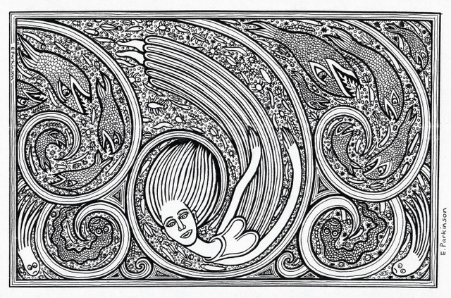
One of the artists taking part is Valerie Potter. Valerie’s work is, Sue says, “like that of an angst ridden teenage boy, but then she comes in with the Jane Austen cross stitching. It’s very emotional to look at.” Liz Parkinson’s works are obsessive, repetitive, symmetrical depictions of faces with snakes and reptiles. “She sits at my kitchen table and she draws and draws.” Art critics have previously disregarded Liz’s snakes as ‘Freudian’ – in fact, Liz has suffered with eczema for many years, creating an emotional attachment to the image of a snake shedding its skin. Other artists involved in the show include Claudia Benassai, Kate Bradbury, Manuel Bonifacio, and Judith McNicol – plus many more.
Liz Parkinson, Tsunami (courtesy of uncookedculture.ning.com)
Talking about the – very topical – debate surrounding Outsider Art, Sue says that the subject is simultaneously complicated and uncomplicated. Originally, it best described work that was completely outside of the mainstream; it described artists with mental ill health, those who were isolated or not aware of the bigger, wider art world. Although there are hints of this today, it is not nearly as extreme. “When you discover an Outsider Artist,” Sue says, “suddenly they’re not outside anymore – they are not as naïve as they used to be.”
Sue is keen on anything that gives a voice to Outsider Art – the recent spate of mainstream Outsider Art exhibitions, for example; Souzou at the Wellcome Collection and the Alternative Guide to the Universe. However, she warns us of the involvement of academics or curators, people who are likely to make rules: “I don’t like people saying ‘this is what it is’. It becomes meaningless when there are rules.”
The mainstream art world, to Sue, is – and should remain – completely disparate to the world of Outsider Art. The conventional art world revolves around money, around prestige, and around the commercial, or commodity. Outsider Artists are driven to create – not for money, but for sanity; it comes “from their gut.” They create as a way of expressing their angst. “Creating art for Outsider Artists is self-medication,” says Sue, “just in the same way that alcoholics and drug addicts self-medicate.”
Claudia Benassai, ‘Peeping Tom’
“If you hang out with us, you may experience epiphanies, revelations and visions. Visit us and you might burst into art, aflame with colour, exaltation and obsessive creativity. We are Outsider Artists, working far beyond the margins of the conventional art world. Untutored, obsessive, producing art for our own pleasure and therapy, inventing techniques, scavenging for unexpected materials, we are united in our need to express beliefs, angst, political and spiritual views, through art.”
Sue’s ultimate concern is that Outsider Art, the only ‘real’ art, will be engulfed by the ‘rule-setting’ conventional art world. “I want to stay outside. I want to find people who are obsessive, who have to do it. I will remain outside.”
‘Epiphanies! Secrets of Outsider Art’ is on from 26 September – 28 November 2013 at The Conference Centre, St Pancras Hospital, London. Click here for more information